TL;DR
I built a quasi-Sharpe ratio for NFL draft picks, a risk-adjusted measure of what each position is worth at each draft slot, accounting for rookie contract surplus, second-contract value, and supply-controlled free agency replacement costs. The model suggests that QB produces the strongest risk-adjusted returns in the top 10, while OT and EDGE peak in the late first round and WR offers the best value in Round 2. RB shows negative returns across all tiers in this framework, driven by cheap FA alternatives and a low contract ceiling. A large share of the total return from any draft pick comes from rookie contract surplus (getting starter production at a fraction of free agency cost for 4 years) rather than the second contract itself. These findings come with important caveats (see Assumptions at the end): snap share is an imperfect proxy for production, the model doesn’t capture positional scarcity or team-specific needs, and some sample sizes are small.
What About Love at 3?
Mock drafts have Jeremiah Love going as high as #3 overall. Computing the Sharpe ratio for RBs drafted at picks 2-5 (n=4), we get -0.97. Zooming out to all top-10 RBs, the Sharpe is -0.62, the worst of any offensive position. Here’s why:
- Hit rate is fine (71.4%); top-10 RBs usually become starters.
- But the rookie surplus is tiny. FA RBs cost just 6.0% of the cap, the cheapest position to replace in free agency.
- And the second-contract ceiling is low. The best RB deal is ~8% of cap. The best WR deal is ~14%. The upside is structurally capped.
- The opportunity cost is real. QB leads all positions in top-10 Sharpe (0.37), and the best risk-adjusted slot in the draft is EDGE in the late first (Sharpe: 0.59). Even a Round 2 WR (Sharpe: 0.23) shows stronger risk-adjusted returns than a top-10 RB.
What does this look like in practice? Here are all 7 RBs drafted in the top 10 since 2010:
| Player | Pick | Year | Hit? | Player Return1 |
|---|---|---|---|---|
| Todd Gurley | #10 | 2015 | Yes | 31.3% |
| Christian McCaffrey | #8 | 2017 | Yes | 28.9% |
| Ezekiel Elliott | #4 | 2016 | Yes | 21.6% |
| Leonard Fournette | #4 | 2017 | Yes | 13.0% |
| Saquon Barkley | #2 | 2018 | Yes | 12.2% |
| C.J. Spiller | #9 | 2010 | No | 9.4% |
| Trent Richardson | #3 | 2012 | No | 6.6% |
| 1 Elite threshold: 33.1% | None of these players reached it. | ||||
Five of seven became starters. The hit rate (71%) is solid. But zero produced an elite return. The highest return belongs to Todd Gurley at 31.3%, followed by Christian McCaffrey at 28.9%, both short of the 33.1% elite threshold.
At pick #3, the positions that do produce elite returns are QB, EDGE, and OT, the positions where top-10 Sharpe is positive. If you need a running back, Round 2 or Round 3 gets you nearly equivalent production at a fraction of the draft capital cost.
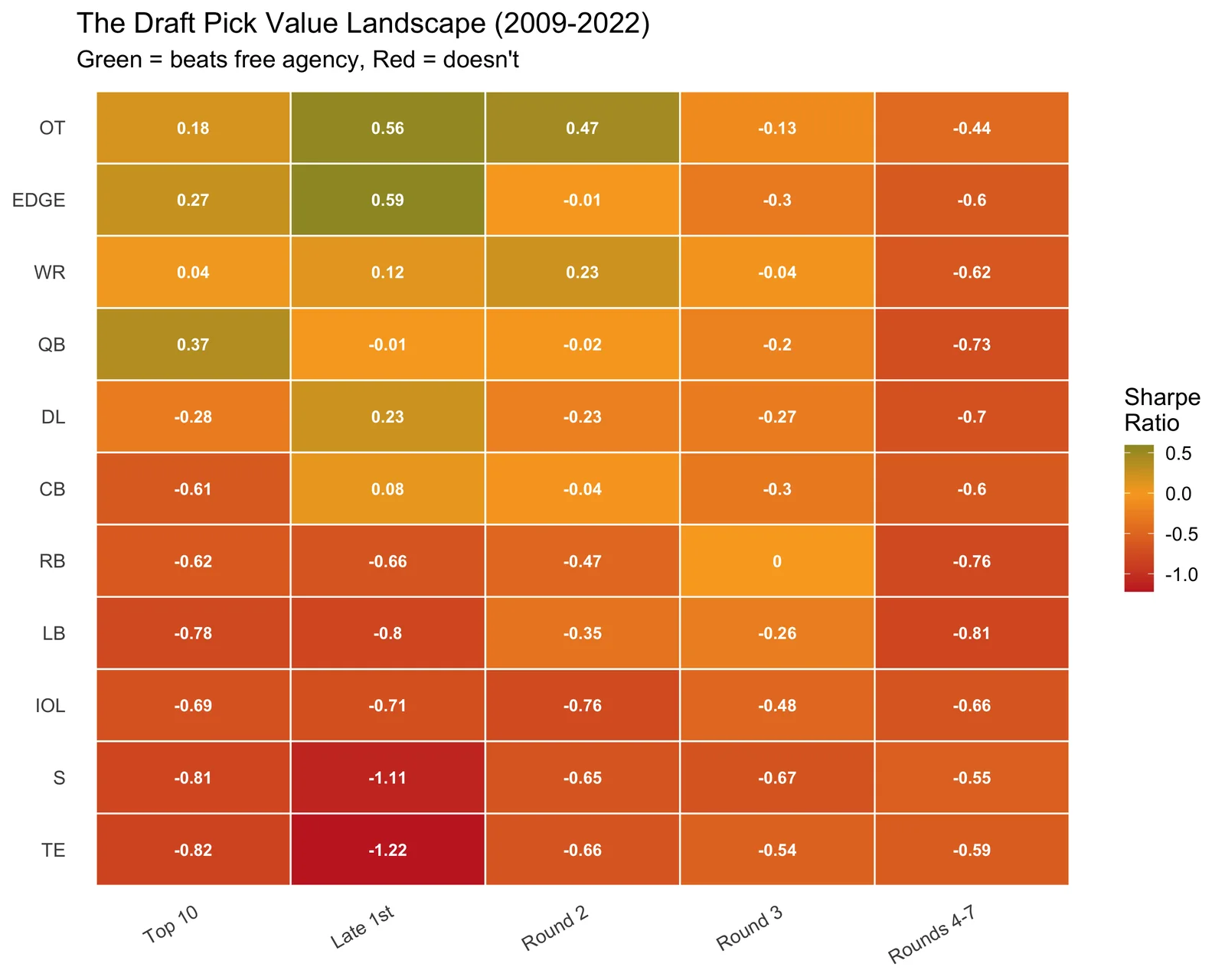
This is the whole story in one chart. Green cells are where the draft beats free agency; red cells are where it doesn’t. Most of the green is in the late first and Round 2, not the top 10. The rest of this analysis explains why.
The Setup
Traditional draft pick valuation treats picks as interchangeable assets: a “top 10 pick” has one value regardless of whether you’re drafting a quarterback or a running back. But the return on investment varies enormously by position. A quasi-Sharpe ratio lets us quantify this: which positions justify premium draft capital, and which ones are better addressed later, or in free agency?
This analysis combines three frameworks:
Hit Rate (Riske/PFF): A player is a “hit” if their average snap percentage over their first 4 NFL seasons reaches at least 75% of the positional baseline. Snap % is averaged over ALL expected games (including seasons not played as zero), so injuries and busts are properly penalized.
Nonlinear Upside (Brill & Wyner 2024): Not all hits are equal. I capture the right-tail with a player return that combines rookie-deal surplus AND second-contract value.
Salary data from OverTheCap via nflreadr. All contract values normalized to % of salary cap to control for cap inflation across eras.
Why 2022? A fair evaluation requires at least 4 NFL seasons, enough to complete a rookie deal and either earn a second contract or wash out. Players drafted after 2022 haven’t had that runway yet, so including them would bias results toward high rookie surplus and $0 second contracts. By stopping at 2022, every player in the dataset has had a real chance to prove (or not prove) their value.
Standing on Shoulders
This analysis builds directly on two key pieces of work:
Timo Riske’s hit rate methodology (PFF, 2022): Riske defined what a draft “hit” means: a player whose snap share over their first 4 seasons exceeds a fraction of the positional baseline. I tighten his original 2/3 threshold to 75% to better align with the elite-probability Sharpe formulation, but use the same positional baselines as the foundation for the snap ratio. His work also informs the Eric Eager collaboration below.
Brill & Wyner (2024) (arXiv:2407.00730, with analysis popularized by Eric Eager at PFF): Their key insight is that draft pick value is nonlinear - variance decays convexly across rounds, meaning earlier picks have fatter right tails. I operationalize this through the elite probability component of the Sharpe ratio: P(elite) captures the right-tail upside that a simple average would miss. Where Brill & Wyner measured upside through career approximate value, I extend it with cap-normalized contract data to make cross-era and cross-position comparisons possible.
My contribution is combining these frameworks into a single risk-adjusted metric (the quasi-Sharpe ratio) and adding two new dimensions: rookie contract surplus (the hidden majority of draft value) and supply-controlled FA replacement (because “just sign a free agent” isn’t equally realistic at every position).
The Formula
The return on a draft pick comes from two sources:
1. Rookie Contract Surplus. You get starter-level production at a fraction of market cost.
\[\text{Rookie Surplus} = \text{Snap Ratio} \times (\text{FA Replacement Cost} - \text{Rookie Salary}) \times 4 \text{ years}\]
2. Second Contract. The market’s verdict on whether the player was worth it.
\[\text{Player Return} = \text{Second Contract Cap\%} + \text{Rookie Surplus}\]
Then the Sharpe ratio measures risk-adjusted return above the free-agency alternative:
\[\text{Sharpe} = \frac{P(\text{elite}) \times \text{Elite Threshold} - \text{FA Replacement Cost}}{SD(\text{Player Return})}\]
| Component | What it measures | How it’s computed |
|---|---|---|
| Snap Ratio | Playing time vs positional baseline | avg snap % / hit threshold (1.0 = starter) |
| Rookie Surplus | Cap savings during rookie deal | snap_ratio x (FA cost - rookie salary) x 4 years |
| Second Contract | Market value after rookie deal | APY as % of salary cap on next deal |
| Player Return | Total value of the pick | second contract + rookie surplus |
| Elite Threshold | Top-tier outcome bar | 90th percentile of all player returns |
| FA Replacement | Cost of buying a starter instead | Median of top-N FA contracts/yr; N = avg starter-caliber FAs available per position |
| Volatility | Outcome variance in that bucket | Std dev of player returns (including busts at $0) |
Worked Example: QB Top 10 vs RB Top 10
Walking through the formula with real numbers:
| Step | What it means | QB Top 10 | RB Top 10 |
|---|---|---|---|
| P(elite) | % of picks producing a top-10% return | 73.1% | 0.0% |
| Elite Threshold | The top-10% return bar (same for all positions) | 33.1% | 33.1% |
| P(elite) × Threshold | Expected payoff from elite outcomes | 24.2% | 0.0% |
| FA Replacement | Cost to sign a starter instead | 14.6% | 6.0% |
| Numerator | Expected value over replacement | 0.096 | -0.06 |
| SD (volatility) | How risky is this bet? | 25.7% | 9.7% |
| Sharpe | Risk-adjusted return | 0.37 | -0.62 |
QB Top 10: 73% of top-10 QBs produce elite returns, and FA QBs are expensive (14.6% of cap), but the expected elite payoff (24.2%) still exceeds the FA cost, so the numerator is positive. Even with high variance, the Sharpe is +0.37.
RB Top 10: 0% of top-10 RBs produced an elite return. None cracked the top 10% of all players. So the expected elite payoff is zero, but you’re still paying 6.0% in FA opportunity cost. The numerator goes negative, giving a Sharpe of -0.62. The math says: just sign a free agent.
Player Example: Saquon Barkley
| Saquon Barkley - Pick #2, 2018 | ||
| Metric | Value | What it means |
|---|---|---|
| Avg snap % | 48.0% | Averaged over first 4 NFL seasons |
| Snap ratio | 1.14× | Relative to RB starter baseline (he was a hit) |
| Rookie deal APY | 4.4% | Cost of his rookie contract as % of cap |
| FA median (RB) | 6.0% | What a starting RB costs in free agency |
| Rookie surplus | 7.3% | 4 years of savings from paying a starter on a rookie deal |
| Second contract APY | 4.9% | His second deal was only 4.9% of cap |
| Player return | 12.2% | Rookie surplus + second contract = total value generated |
| Elite threshold | 33.1% | Top 10% of all player returns across all positions |
Saquon was a hit: he started, he produced, he earned a second contract. But his total return (12.2%) is well below the elite threshold (33.1%). That’s because RB second contracts are small. Saquon’s 4.9% of cap is a fraction of what a QB or WR earns. His rookie surplus (7.3%) does the heavy lifting, but it’s not enough to reach elite territory.
This is exactly why RB Top 10 has a Sharpe of -0.62: even when the pick works, the return doesn’t justify the draft capital. Zero of 7 top-10 RBs in the dataset reached the elite threshold. The best outcome for a top-10 RB still looks mediocre compared to what that pick could have been.
For comparison, Christian McCaffrey (Pick #8, 2017), often cited as the best-case RB, returned 28.9% of cap. Even that is below the 33.1% elite threshold, though it’s the closest any top-10 RB got. His second contract (8.1%) was larger than Saquon’s, but the real difference was snap share: CMC averaged 64.6% of snaps (ratio: 1.53×), generating a much larger rookie surplus of 20.8%.
Where Each Piece Comes From
This formula combines two existing frameworks with new additions:
P(elite) and Elite Threshold come from Brill & Wyner (2024). Their key insight: draft pick value is nonlinear. Earlier picks have fatter right tails. Using P(elite) instead of the average return captures this. A simple average would miss the boom outcomes that make top picks valuable.
FA Replacement and the hit classification build on Timo Riske’s methodology at PFF. His snap share baselines define what a “starter” looks like at each position, which determines both the hit threshold and the snap ratio used in rookie surplus.
Rookie contract surplus and supply-controlled FA replacement are new. Neither source quantified the cap savings from having a starter on a rookie deal, or calibrated FA cost to actual market supply by position.
Why rookie surplus matters: For most players with positive returns, the rookie contract accounts for 77-95% of the total return (interquartile range). When you draft a player who starts, you’re getting production at a fraction of what it costs in free agency, and that gap, multiplied by 4 years, adds up.

What Does a “Hit” Mean?
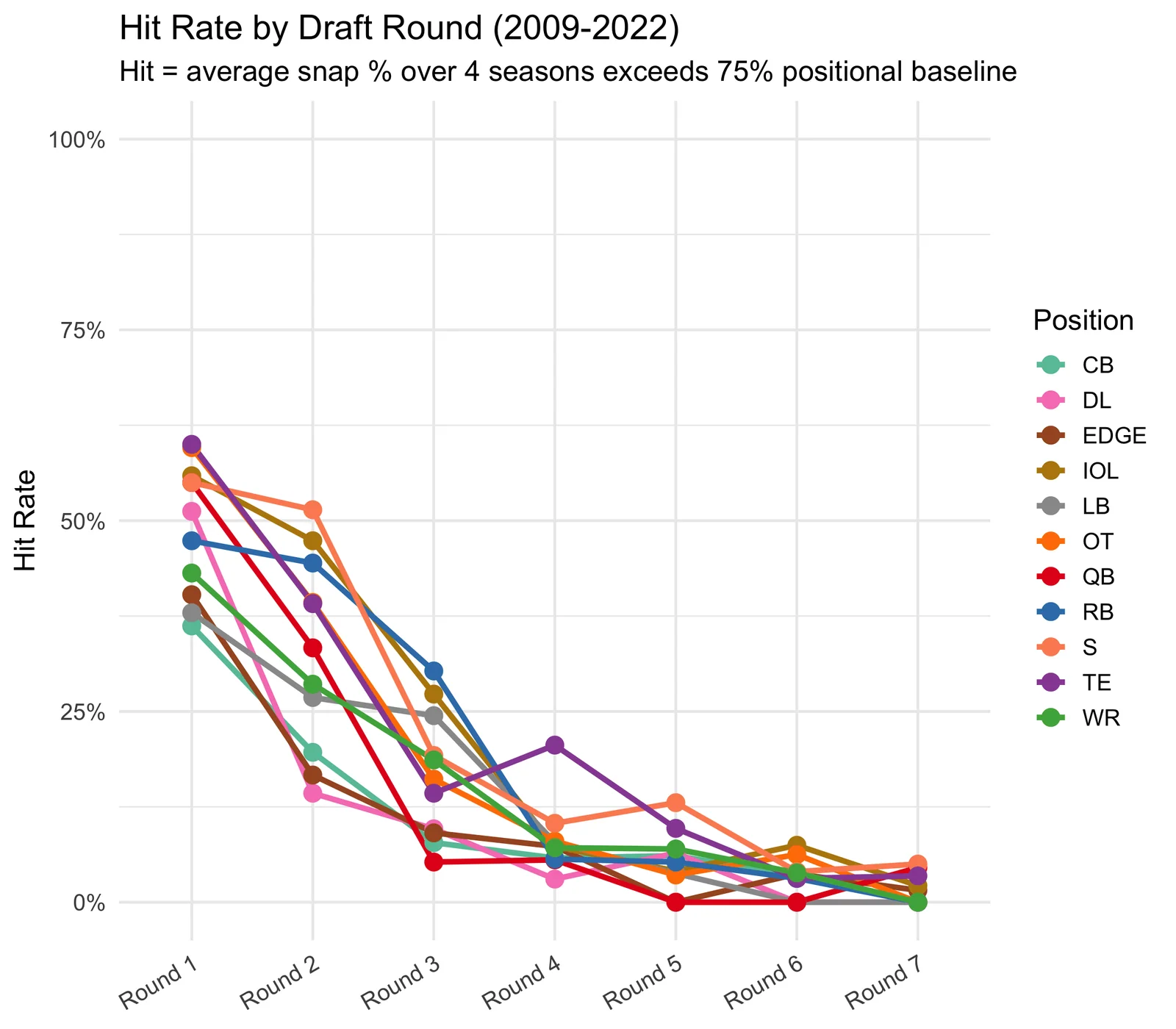
How often does a draft pick become a starter? I classify a player as a “hit” if they play at least 75% as much as an established starter at their position over their first 4 NFL seasons. The threshold varies by position because not every position plays every snap:
| Position | No. 1 starter snap % | Hit threshold (75% of that) | What it means |
|---|---|---|---|
| IOL | 99.6% | 74.7% | On the field nearly every play for 3+ years |
| OT | 97.3% | 73.0% | Same - linemen don’t rotate |
| S | 95.2% | 71.4% | Safeties play almost every defensive snap |
| LB | 92.3% | 69.2% | Occasionally rotate in sub packages |
| CB | 92.3% | 69.2% | Occasionally rotate in sub packages |
| WR | 85.3% | 64.0% | Come off in heavy sets and some run formations |
| QB | 82.9% | 62.2% | Starters play every snap when healthy - injuries drive this down |
| EDGE | 81.2% | 60.9% | Rotate with other pass rushers on some downs |
| DL | 71.7% | 53.8% | Heavy rotation - even stars share snaps with the line |
| TE | 71.2% | 53.4% | Many offenses rotate TEs situationally |
| RB | 56.4% | 42.3% | Even a bellcow comes off for passing downs and in committee |
Snap % is averaged over all expected games across 4 seasons. Missed games due to injury count as zeros, so availability matters. A player who tears their ACL and misses a full season still clears the threshold at every position if they’re a starter when healthy (75% of snaps played × 3/4 seasons ≈ 56%).
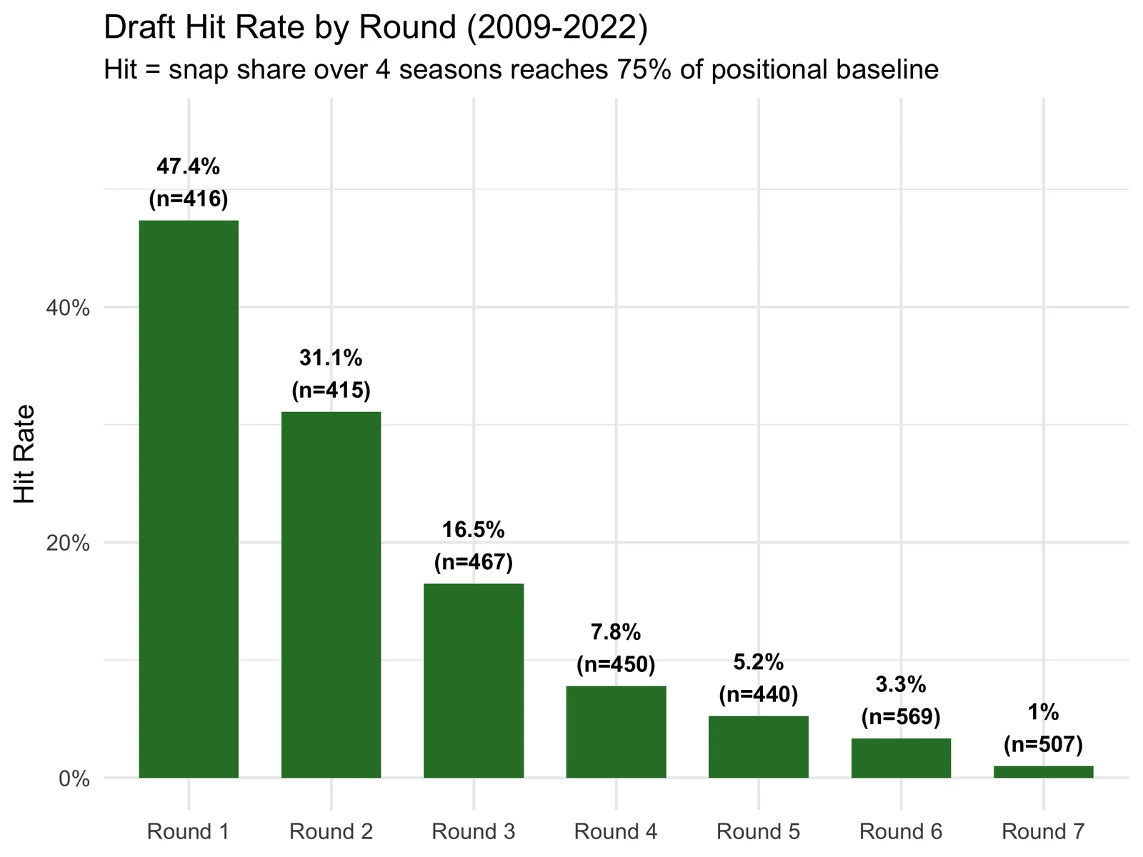
Breaking this down by position and tier reveals where the hits are concentrated:
Supply-Controlled Free Agency Replacement Cost
The “risk-free rate” in the Sharpe ratio. Instead of drafting, a team could sign a free agent. But not every position has the same FA market depth.
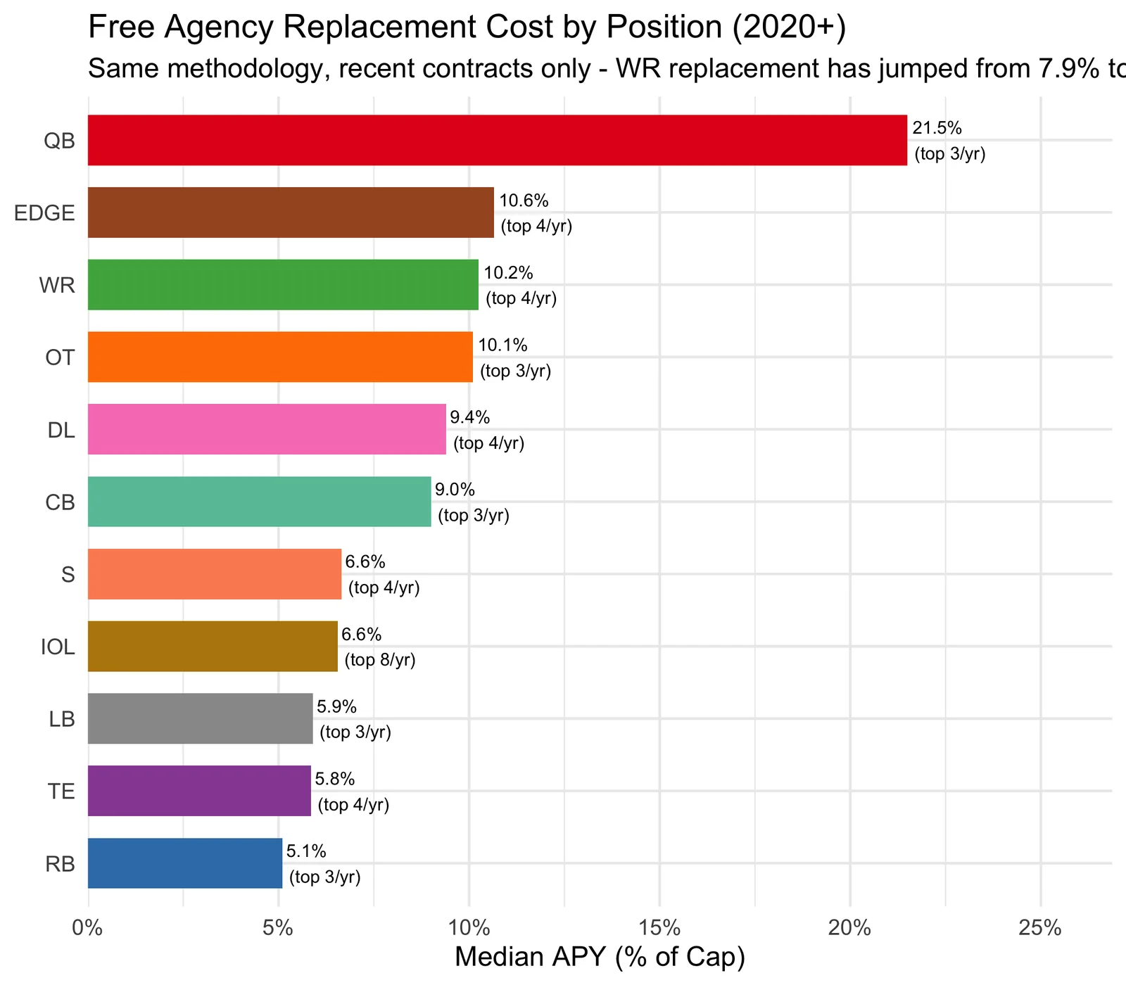
Only 3 starter-caliber OTs and 3 QBs hit free agency per year, while 8 IOL are available.
I define “starter-caliber” by connecting FA contracts back to the Riske hit methodology: first, identify drafted players who were hits (snap share ≥ 75% positional baseline over 4 seasons). Then look at what those hits earned on their second contracts and take the 25th percentile as a floor. If a free agent signs for at least that much, the market is telling us they’re starter-caliber. I count how many such contracts are signed per position per year (the supply, N), and the FA replacement cost is the median contract among those top-N signings each year.
This matters because positions with thin FA markets (OT, QB) have inflated top-contract prices that don’t represent realistic alternatives.
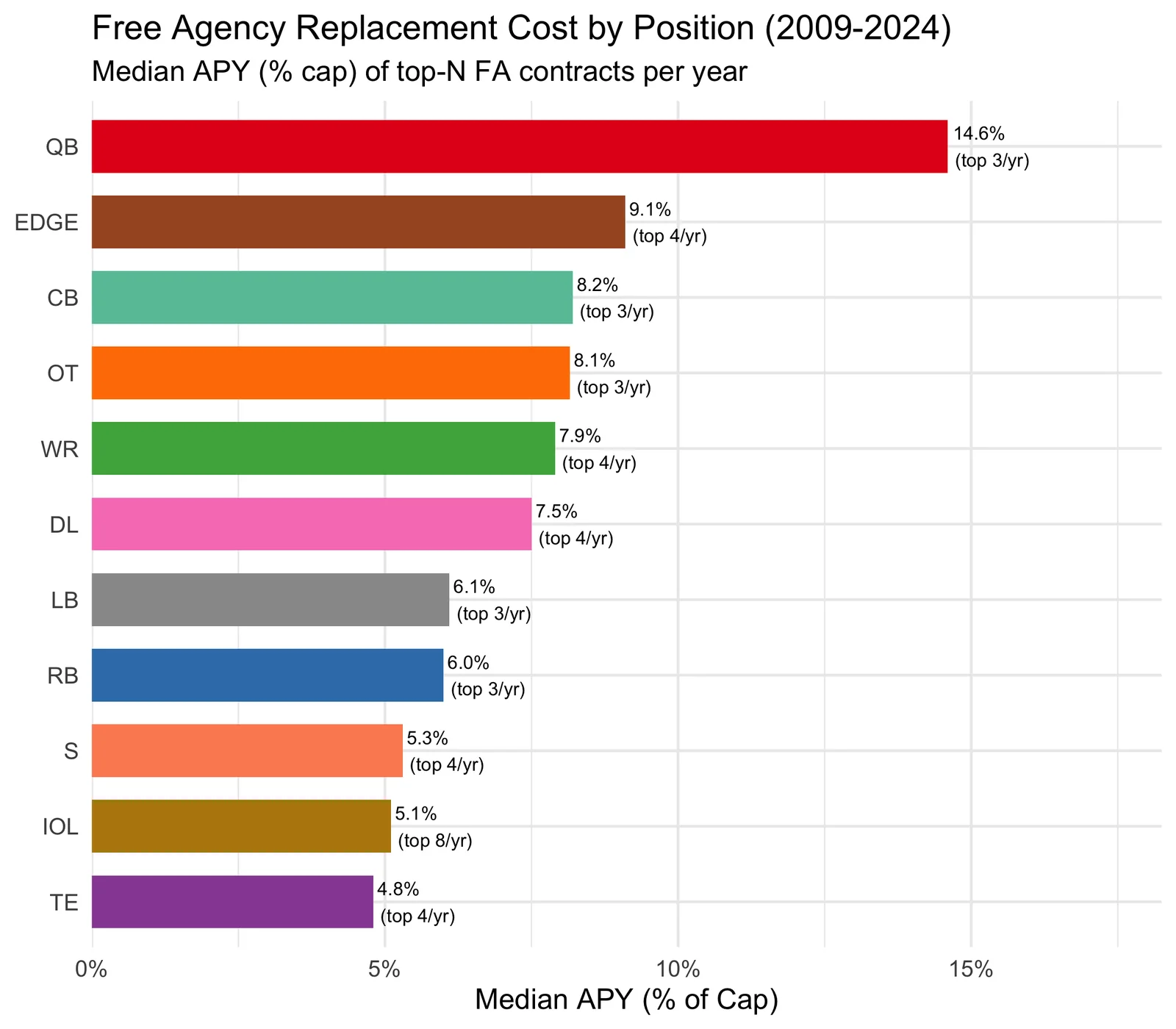
For context, the chart above uses all available contract years to get stable estimates. But the FA market has shifted recently. Here’s what the same numbers look like using only 2020+ contracts:
Sharpe Ratio Curves
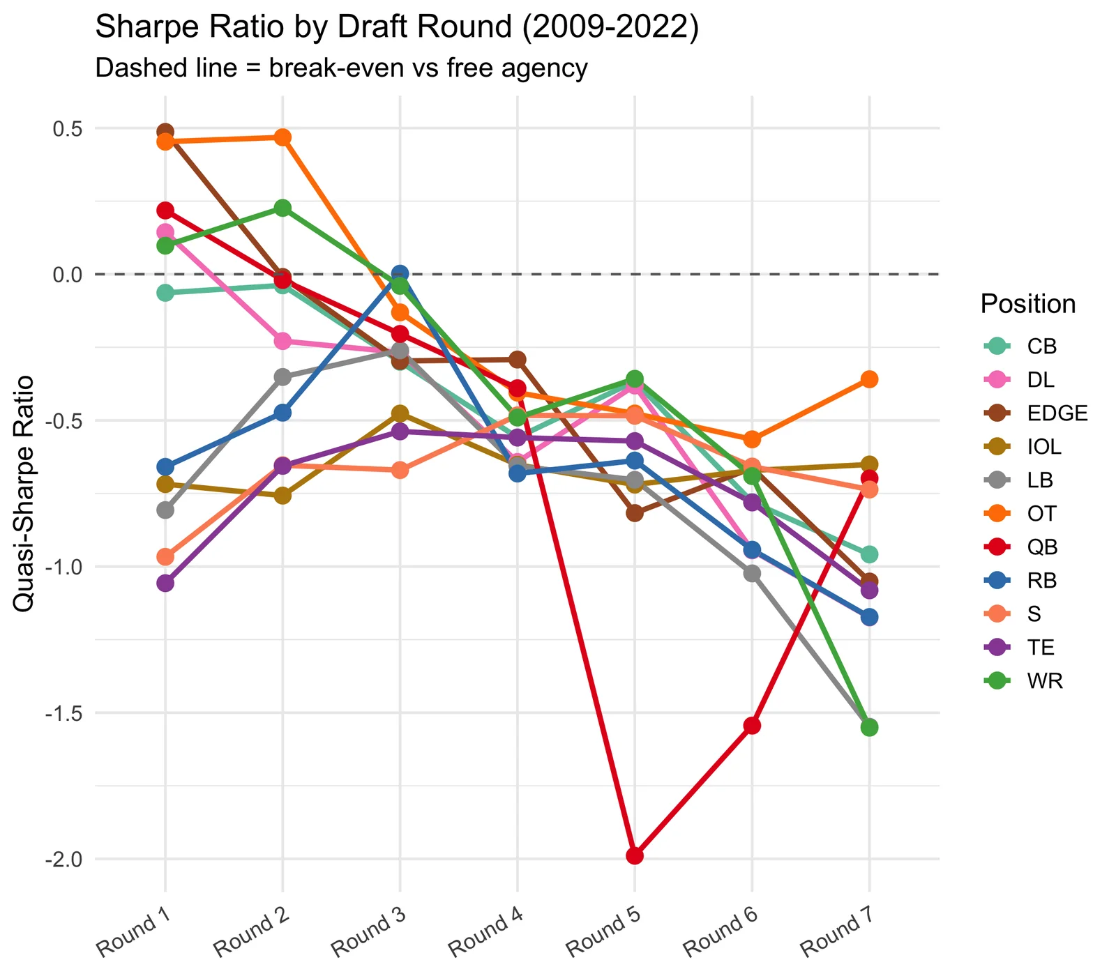
How does the Sharpe ratio decay as you move to later tiers? QB separates immediately. OT and EDGE peak in the late first round, not the top 10.
Is a WR3 Worth More Than an Elite RB1?
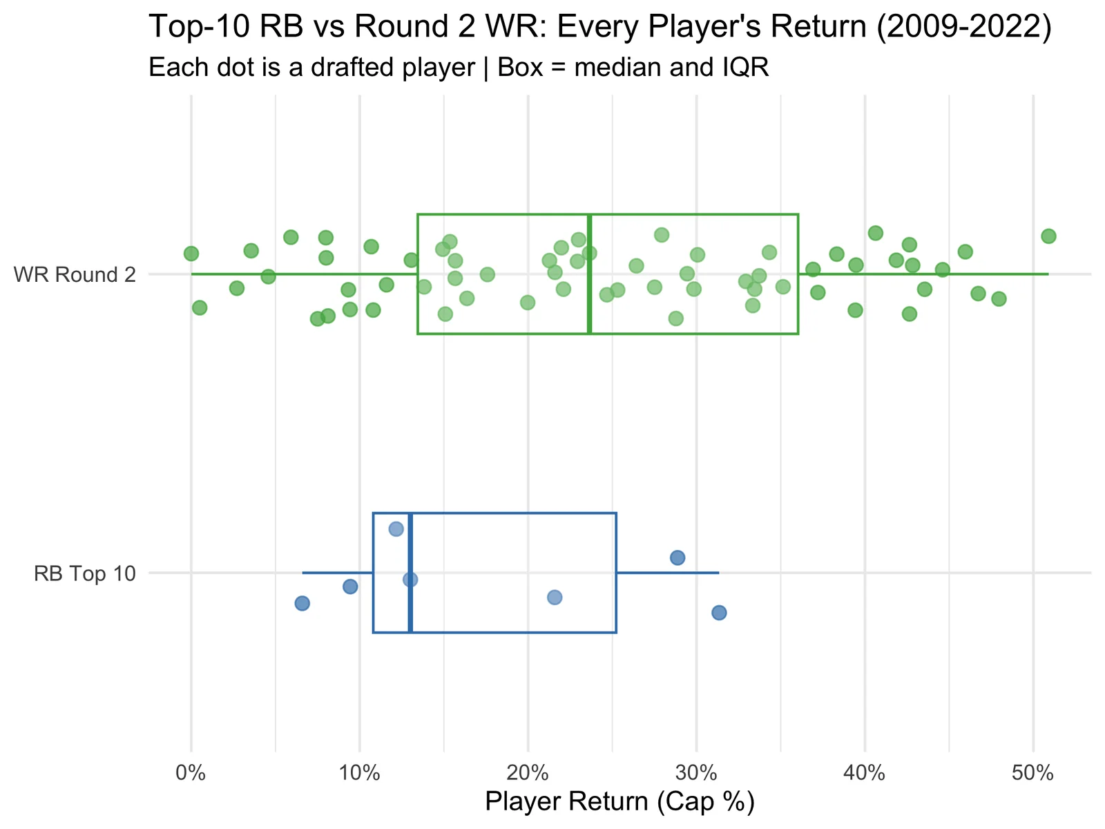
Rashid Shaheed, a WR3, just signed for $17M per year. Only 2 running backs in the entire league earn more (Saquon Barkley and Christian McCaffrey). The WR market is roughly double the RB market at the top end.
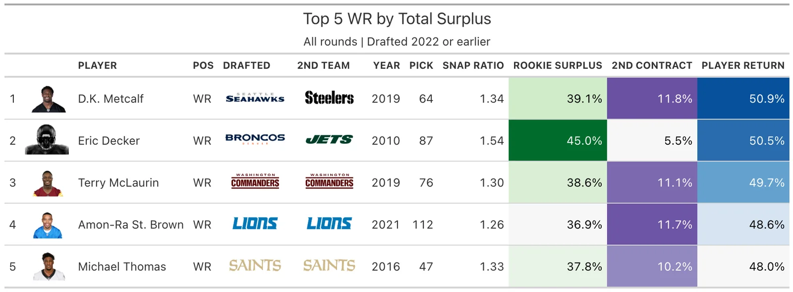
This shows up clearly in the data. The best top-10 RB return in the dataset (Todd Gurley: 0.313) barely matches the median Round 2 WR (0.236). Names like DK Metcalf (pick 64), Davante Adams (pick 53), and A.J. Brown (pick 51) all returned more than any top-10 RB since 2009.
RB Top 10 Sharpe: -0.62 vs WR Round 2 Sharpe: 0.23
Why? Two reasons:
Tiny rookie surplus. FA RBs cost just 6.0% of the cap, the lowest of any position. Even when a top-10 RB starts every game, the savings over a free agent are minimal.
Low second-contract ceiling. The best RB second contract in the dataset is ~8% of cap, while top WRs command ~14%. The upside is structurally capped.
The position structurally splits snaps. Even Bijan Robinson, a 1st team All-Pro, plays only ~74% of Atlanta’s offensive snaps. Tyler Allgeier, a 5th-round pick, handles another ~30%. An elite left tackle plays 97% of snaps. The RB position requires a committee, which caps the snap-based surplus any single back can generate.
In this framework, a Round 2 WR looks like a substantially better risk-adjusted investment than a top-10 RB, though this model measures contract value, not on-field impact, a distinction that matters most for running backs.
Are Teams Drafting Optimally?
6 positions show a positive Sharpe somewhere in Round 1: CB, DL, EDGE, OT, QB, WR. The remaining 5 (IOL, LB, RB, S, TE) show negative Sharpe in every first-round slot, suggesting the model doesn’t see enough surplus over free agency to justify the draft capital.
By this measure, 112 of 416 first-round picks (27%) went to positions where the model sees negative returns, though team needs and prospect quality can justify picks the model wouldn’t make.
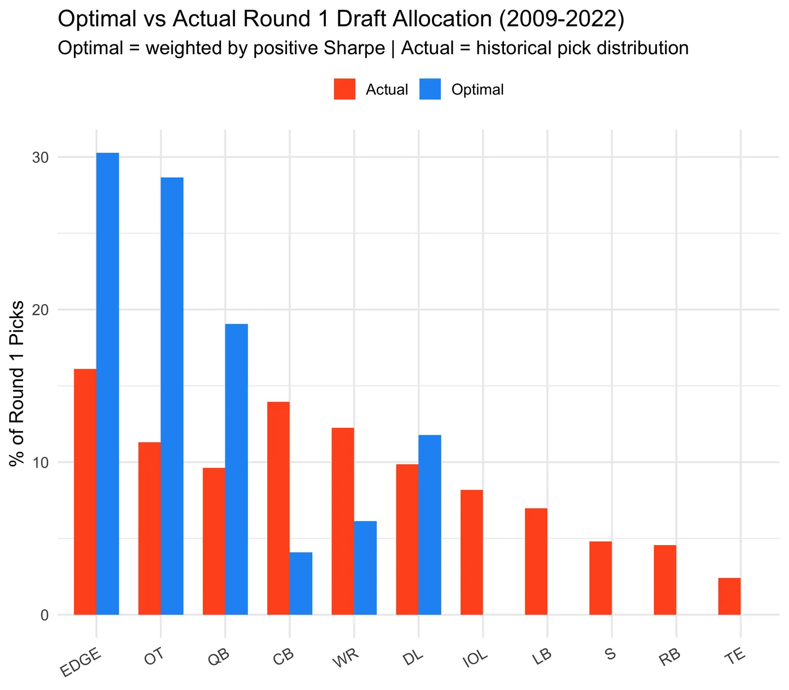
Looking specifically at the top 10: for 98 of 130 picks (75%), a later tier showed a higher Sharpe ratio for that position. This doesn’t mean those picks were wrong; it suggests that on average, the same position has produced better risk-adjusted returns later in the draft. Individual prospect quality matters enormously and isn’t captured here.
Team-Level Draft Efficiency
Which teams have drafted most optimally? I score each team’s Round 1 picks by comparing what they actually drafted to what the Sharpe data says they should have, focusing on the last 5 eligible draft classes (2018-2022), recent enough to reflect current front office philosophy but far enough back that every player has had time for a second contract.
Note: The Rams are absent from these charts because they made zero first-round picks between 2018 and 2022, having traded them away in deals for Jalen Ramsey and Matthew Stafford.
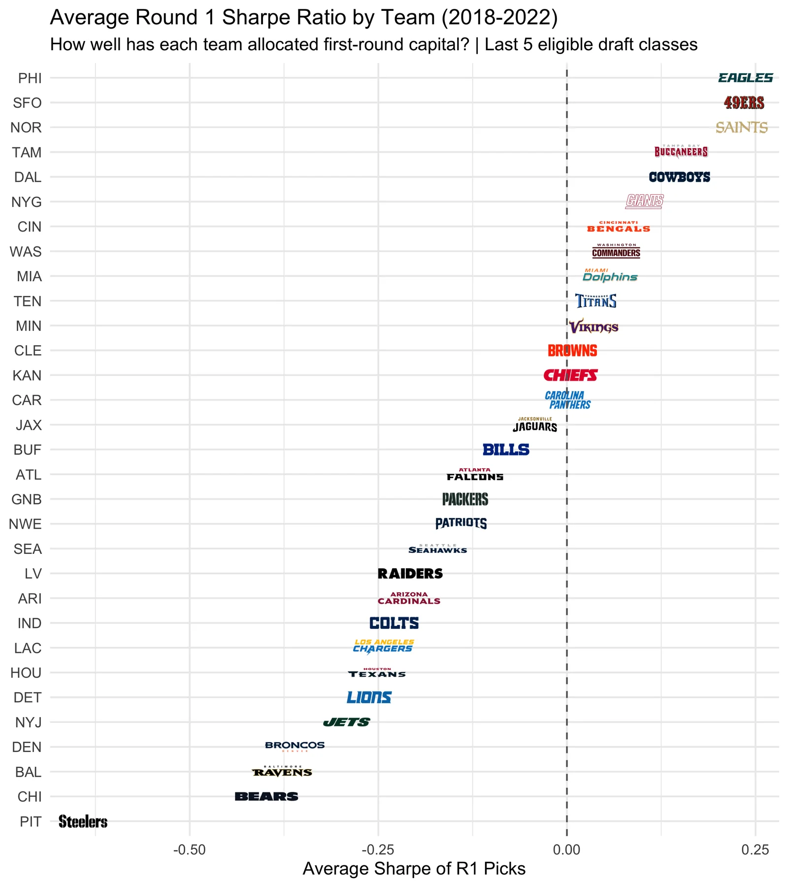
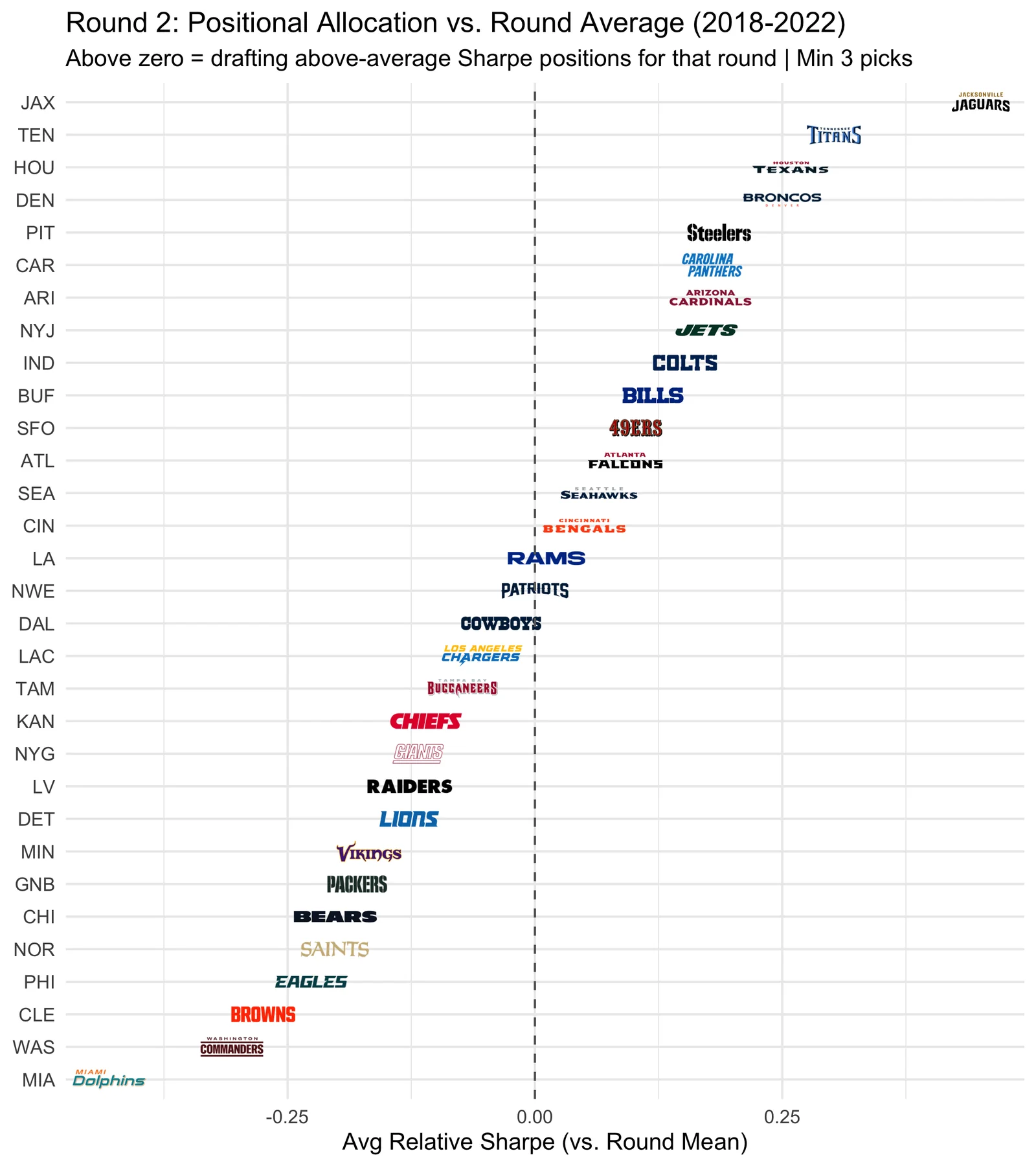
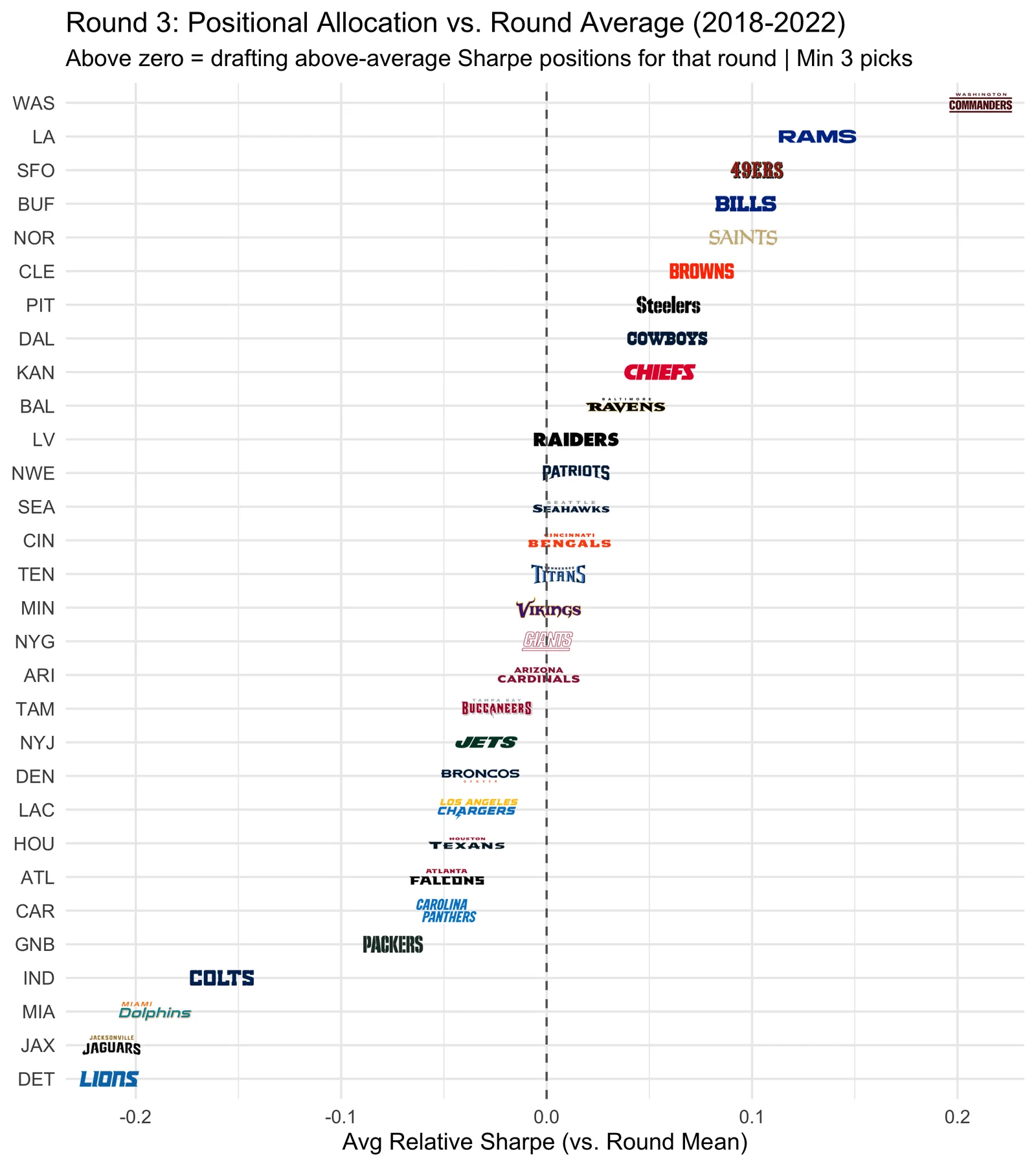
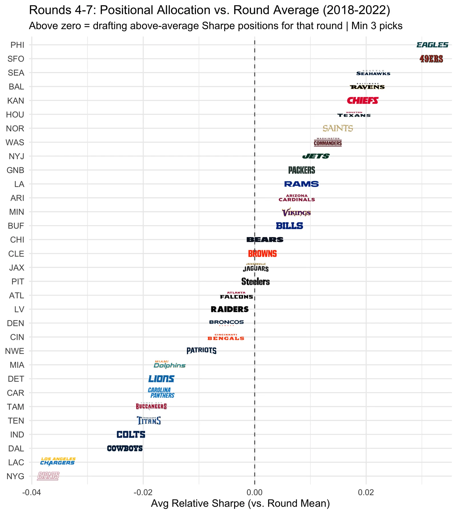
The spread is enormous. PHI averages +0.24 per first-round pick while PIT sits at -0.64. Over 5 draft classes, that’s not randomness; it’s positional philosophy. Teams at the top are investing Round 1 capital in QB, EDGE, and OT, the positions where the Sharpe ratio is actually positive. Teams at the bottom are spending premium picks on positions where the data says free agency is a better path.
In the later rounds, the chart shifts to relative Sharpe: how well each team targets the best-available positions for that round. Since almost every position has negative absolute Sharpe after Round 1, what matters is whether you’re picking the positions that are above or below the round average. A team in blue isn’t necessarily finding elite talent; they’re making the best of the capital they have.
Best Positional Bets by Round
The team charts show who gets it right. But teams draft in every round, and they have to make the pick. The question isn’t “should you draft at all in Round 3?” It’s “given that you’re picking in Round 3, which positions give you the best relative return?”
To answer that, I measure each position’s Sharpe relative to the round average. This controls for the fact that later rounds naturally have lower absolute Sharpe, and surfaces which positions are the best and worst bets at each stage of the draft.
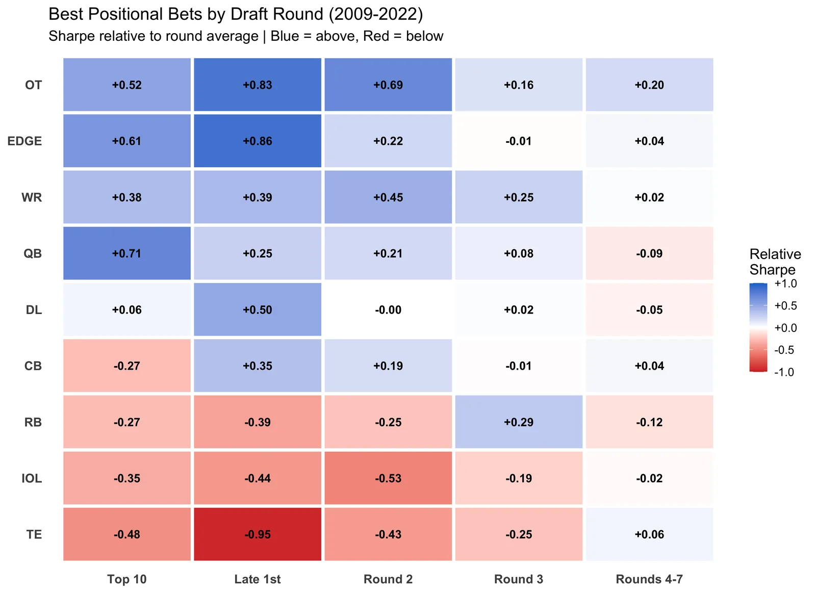
In Round 1, QB, EDGE, and OT are significantly above the round average; these are the positions where early draft capital pays off. Meanwhile, positions like TE and TE are the worst relative bets in the first round.
The later rounds flip the script. By Round 3, the best relative position is actually RB (+0.29 above round average). This doesn’t mean Round 3 RBs produce elite returns (the absolute Sharpe is still low), but it means if you’re going to draft an RB, Round 3 is where the risk-reward ratio is least unfavorable. Similarly, OT remains an above-average bet deep into the draft.
The takeaway for GMs: it’s not just about which positions to draft; it’s about when. The same position can be a great bet in one round and a terrible one in another. Teams systematically overdraft certain positions early and underdraft others late, relative to what the returns actually justify.
Key Takeaways
QB shows the strongest top-10 Sharpe (0.37), driven by a large rookie surplus and elite second contracts. A caveat: projecting QB talent from the NCAA to the NFL is notoriously unreliable, and this model doesn’t account for the difficulty of identifying the right QB prospect. The Sharpe reflects the average payoff conditional on having a top-10 pick. It says the math favors QB, not that the scouting is easy.
The late first round stands out. EDGE Late 1st has the highest Sharpe in the dataset (0.59), and several positions show their best returns in this range. This could reflect better team situations, more NFL-ready players, or simply cheaper draft capital; the model can’t distinguish between these explanations.
WR value appears concentrated in Round 2. The best WR Sharpe (0.47 in Round 2) suggests that comparable WR production is available later in the draft. Players like DK Metcalf (pick 64) and Davante Adams (pick 53) illustrate this, though Round 2 WRs also bust at higher rates.
RB shows negative Sharpe across all tiers in this framework. The combination of cheap FA alternatives and a low second-contract ceiling drives this. However, this model measures contract value, not on-field impact, a difference that matters most for RBs, whose market value systematically understates their contribution.
A large share of top-10 picks go to positions where a later tier shows a higher Sharpe. This doesn’t necessarily mean teams are wrong. Positional scarcity, team needs, and prospect-specific talent all matter and aren’t captured here.
Rookie surplus makes up the majority of a draft pick’s total return. For most positions, getting starter-level production at rookie-scale wages for 4 years is worth more than the second contract itself.
Player Surplus Leaderboard
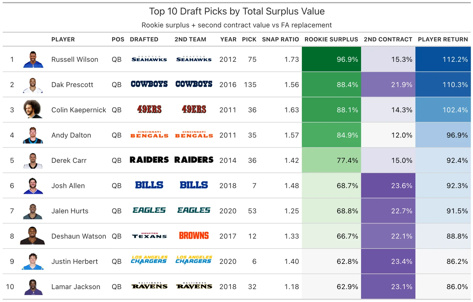
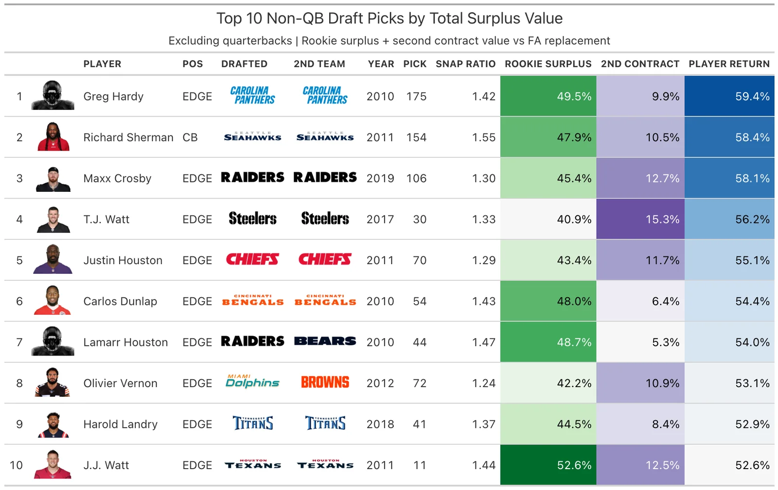
Every drafted player scored by total surplus value generated over their rookie deal and second contract:
Player Return = Rookie Surplus + Second Contract (% of cap)
Rookie surplus measures how much value a player generates above their
cheap rookie salary. It starts with snap ratio, the
player’s average snap percentage divided by the positional hit threshold
(e.g., 75% of snaps for a WR). A snap ratio above 1.0 means the player
is a full-time starter. From there:
Rookie Surplus = snap_ratio x (FA replacement cost - rookie salary) x 4 years,
all expressed as a percentage of the salary cap.
Higher values mean the player delivered more total value relative to what a free-agent replacement would have cost. QBs dominate the overall leaderboard because their second contracts dwarf every other position, which is exactly what makes them the highest-Sharpe pick in the top 10. Below is the top 10 overall, then a separate top 10 excluding QBs.
Assumptions & Potential Improvements
Every model makes simplifying assumptions. Here’s what this analysis assumes and how each could be refined in future work.
| Assumption | Why it matters |
|---|---|
| Snap % = production. Playing time is used as a proxy for quality. | A player can play a lot and still be bad. |
| Second contract = market value. The second deal is treated as the market’s verdict. | Teams overpay and underpay. Extensions ≠ true free agency. |
| FA contracts include extensions. The replacement cost may be inflated by teams retaining their own players. | Makes some positions (OT, QB) look more expensive to replace than they really are. |
| 4-year evaluation window. Snaps are measured over the rookie deal only. | Misses late bloomers and players who improve in year 5+. |
| No second contract = $0. Players who leave the league get zero return. | Some players contributed but aged out (especially RBs). |
| Uniform elite threshold. The 90th percentile is global, not position-specific. | An “elite” QB return is very different from an “elite” RB return. |
| Supply ≈ all contracts above hit threshold. Extensions are counted as FA supply. | Overstates the available market for positions where stars rarely leave. |
| Cap% normalization. Cap% is assumed to be the best cross-era comparator. | Doesn’t account for structural cap changes (e.g., TV deal jumps). |
| Uniform talent across draft classes. Each class is assumed to have roughly equal talent at each position. | In reality, some classes are deep at WR and thin at OT - positional Sharpe ratios would shift year to year. |
| QB projection is reliable. QB is treated like any other position, but projecting NCAA QBs to the NFL is notoriously difficult. | The Sharpe says QB is the best top-10 investment on average - but “on average” hides enormous bust risk. The math still favors taking the shot, but the variance is real. |
How each could be improved:
- Snap % → PFF grades or EPA. Production-weighted returns would be more precise than a pure volume metric.
- Second contract → true FA signings only. Separating extensions from open-market deals would better reflect actual market value.
- FA replacement → team-change contracts only. Filtering out extensions would give a truer picture of what’s actually available to a team shopping free agency, especially for positions where stars rarely leave (OT, QB).
- 4-year window → development curve. An extended window or position-specific development curves could capture late bloomers who break out in year 5+.
- $0 for no second contract → partial credit. Players who contributed during their rookie deal but aged out (especially RBs) could receive credit proportional to their rookie-deal production.
- Global elite threshold → position-specific. Position-specific thresholds would enable fairer within-position analysis, since an “elite” QB return is structurally different from an “elite” S return.
- FA supply → actual team-change frequency. Tracking how often starter-caliber players actually change teams per position per year would tighten the replacement cost estimate.
- Cap% → cap-growth-adjusted values. Adjusting for structural cap jumps (e.g., new TV deals) would improve cross-era comparisons.
- Uniform talent → draft-class strength controls. Year-over-year positional talent adjustments would reduce noise from unusually deep or thin classes.
- QB projection → bust-rate discount. Explicitly modeling the NCAA-to-NFL translation failure rate for QBs could produce a more honest expected value, even though the math still favors taking the shot.
Appendix: The Case for Trading Back
The Sharpe data tells a consistent story: for most positions, the best risk-adjusted returns come from Round 2 or later, not the top of Round 1. Teams that trade back accumulate more picks and more shots at positive-Sharpe slots.
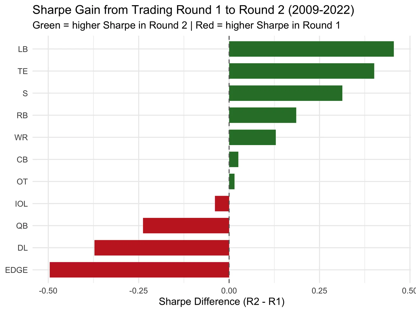
7 of 11 positions show a higher Sharpe in Round 2 than Round 1 (CB, LB, OT, RB, S, TE, WR). Only DL, EDGE, IOL, QB show a meaningfully higher Sharpe in Round 1.
The implication is straightforward: a team that trades back from Round 1 into multiple Round 2 picks gets more shots at positive-Sharpe slots. A single Round 1 pick costs roughly 2-3x as much draft capital as a Round 2 pick (per the traditional trade value charts), but the Sharpe ratio doesn’t reward you 2-3x as much for being in Round 1.
This doesn’t mean Round 1 picks are bad. QB in particular still benefits from the earliest possible selection. But for the majority of positions, the data supports the strategy that teams like Philadelphia, Baltimore, and San Francisco have employed: trade back, accumulate picks, and take more swings in Rounds 2-3 where the Sharpe is often just as strong.
Appendix: Does Sharpe Predict What Teams Actually Draft?
If the Sharpe ratio captures real signal, we’d expect teams to draft high-Sharpe positions more often. Here’s how actual draft behavior lines up with the model.
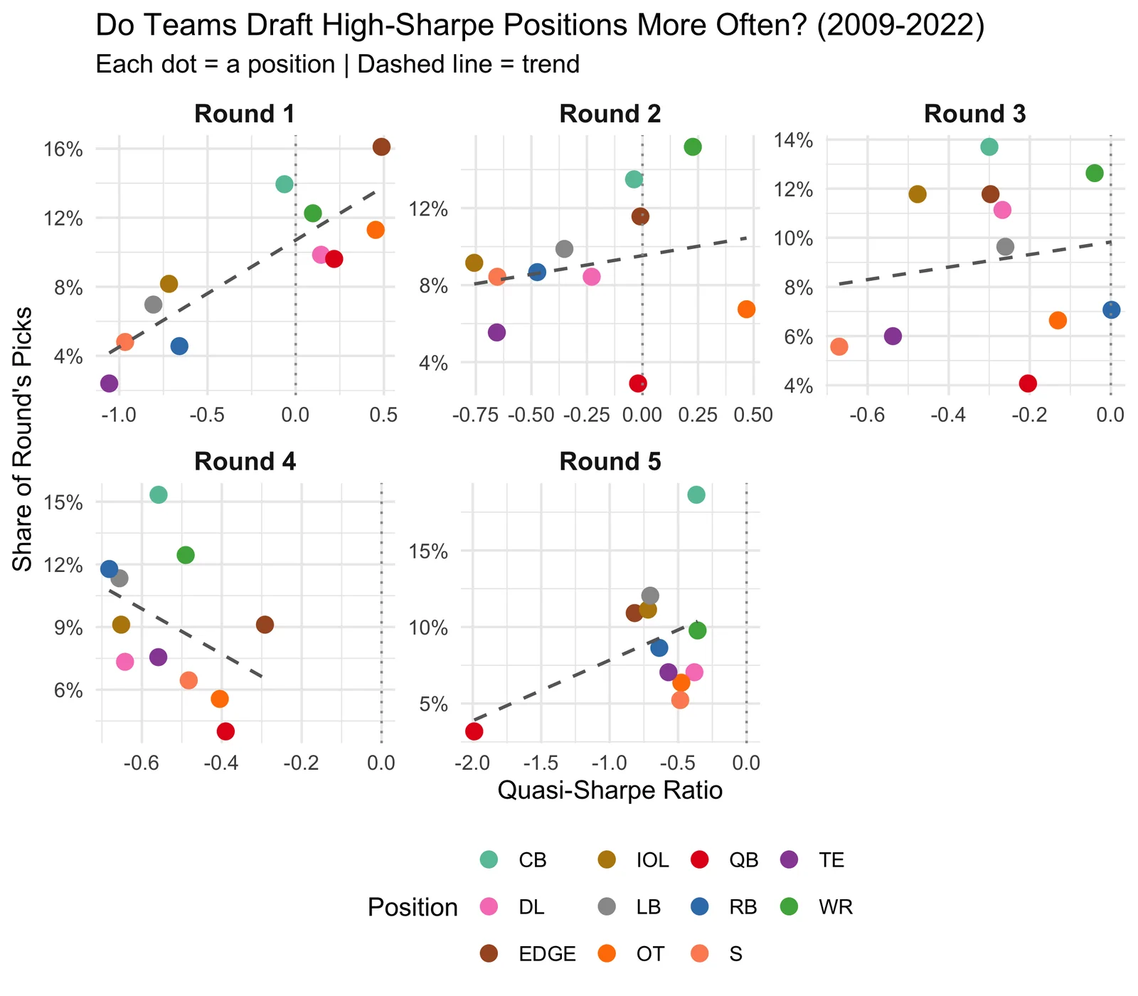
Rank Correlation: Sharpe vs Draft Frequency
| Round | Spearman r | % of picks to positive-Sharpe positions |
|---|---|---|
| Round 1 | 0.79 | 59% |
| Round 2 | 0.2 | 22% |
| Round 3 | 0.06 | 7% |
| Round 4 | -0.46 | 0% |
| Round 5 | 0.1 | 0% |
The average Spearman correlation across rounds is 0.14. There’s a weak positive correlation. Teams partially follow the Sharpe signal, but other factors (need, prospect availability, organizational philosophy) clearly dominate.
In Round 1, 59% of picks go to positions where the model shows a positive Sharpe. The rest go to positions where the model says free agency is the better path. Whether that’s teams being smart about prospect-specific talent or leaving value on the table depends on your view of how projectable individual players are.
Appendix: Round 1 Surplus Leaderboard
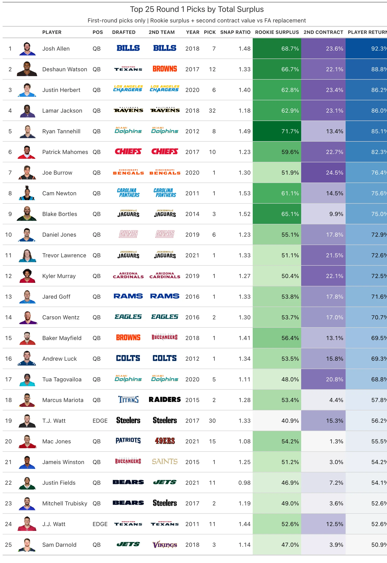
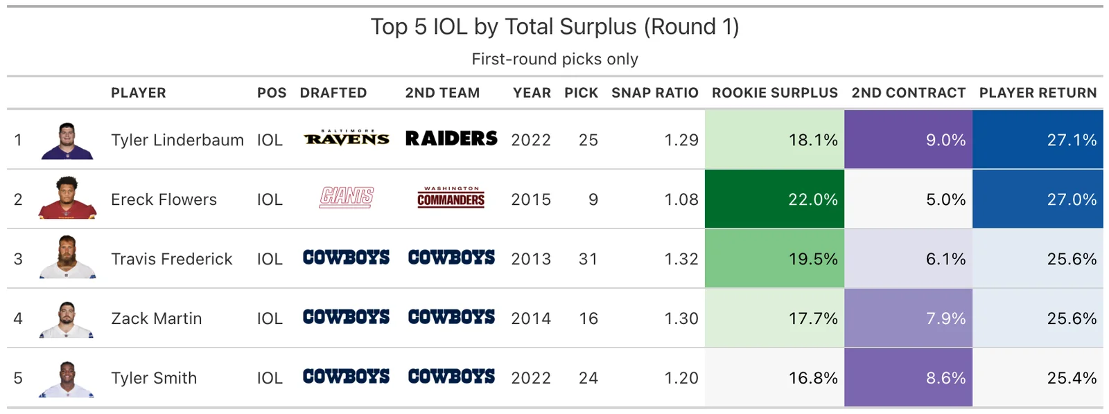
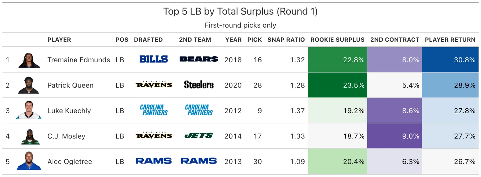
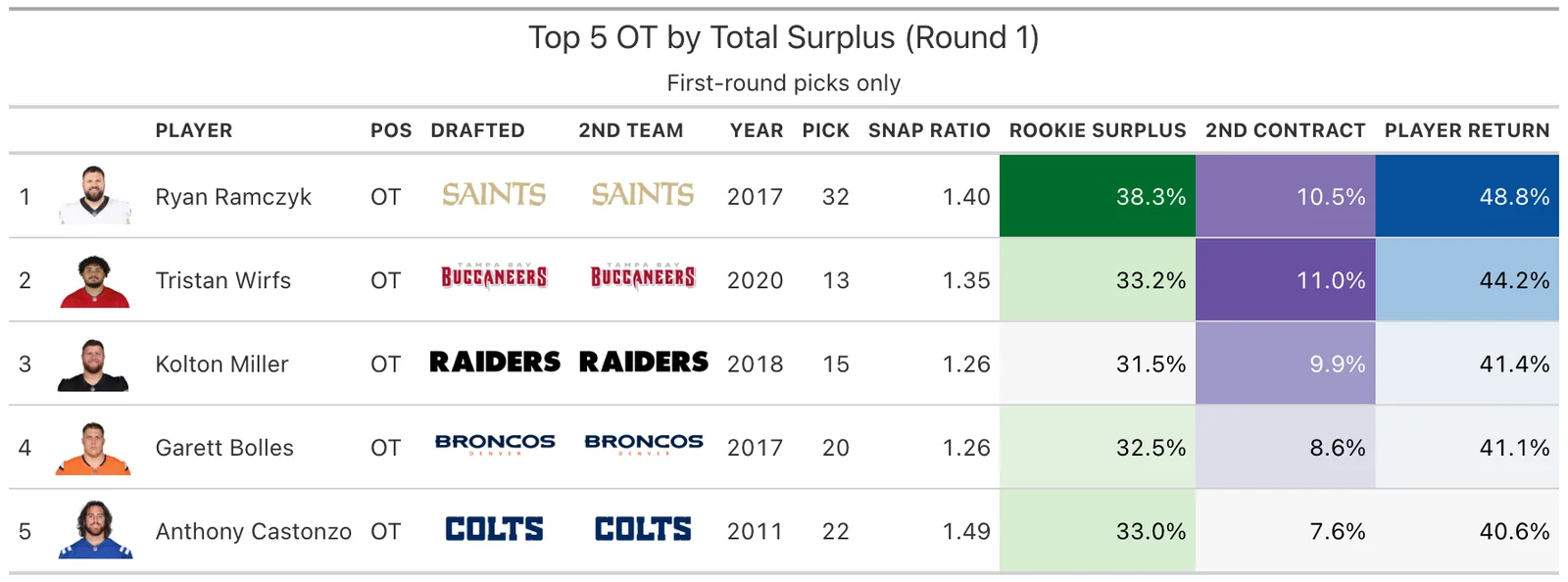
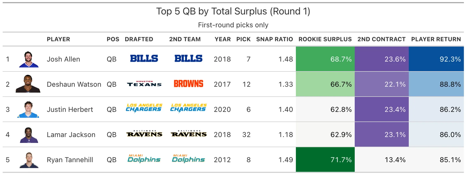
Appendix: Top 5 by Position Group
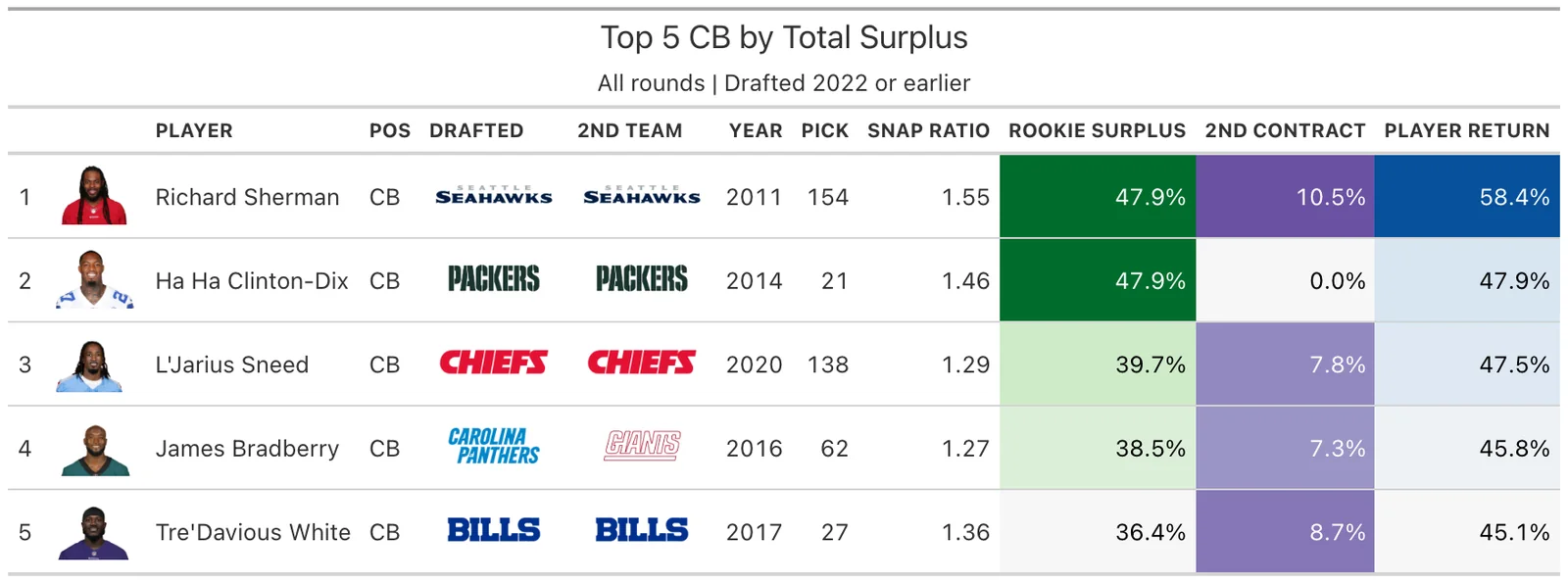
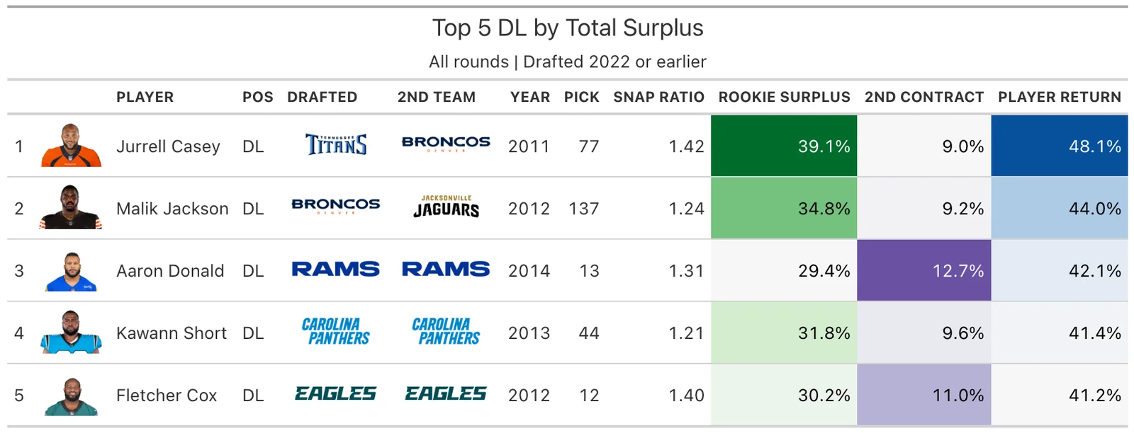
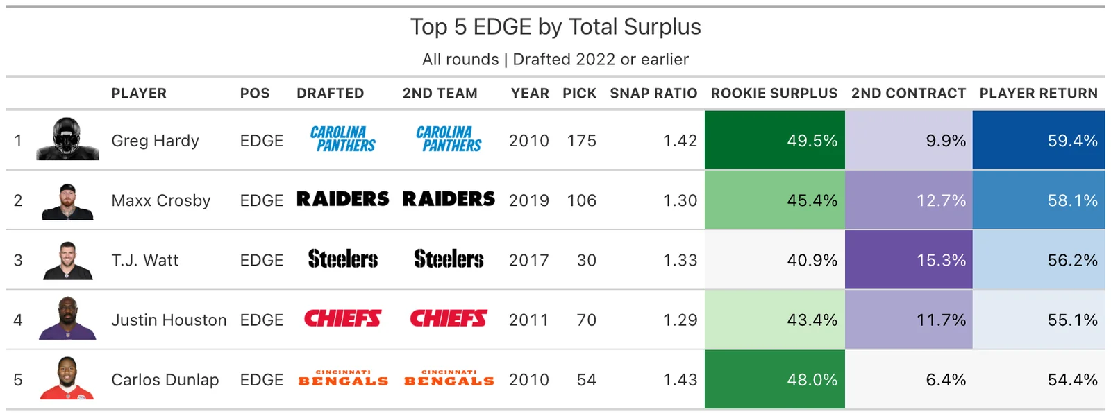
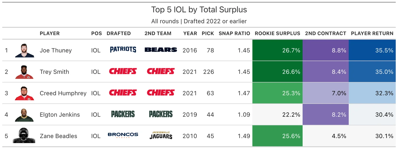
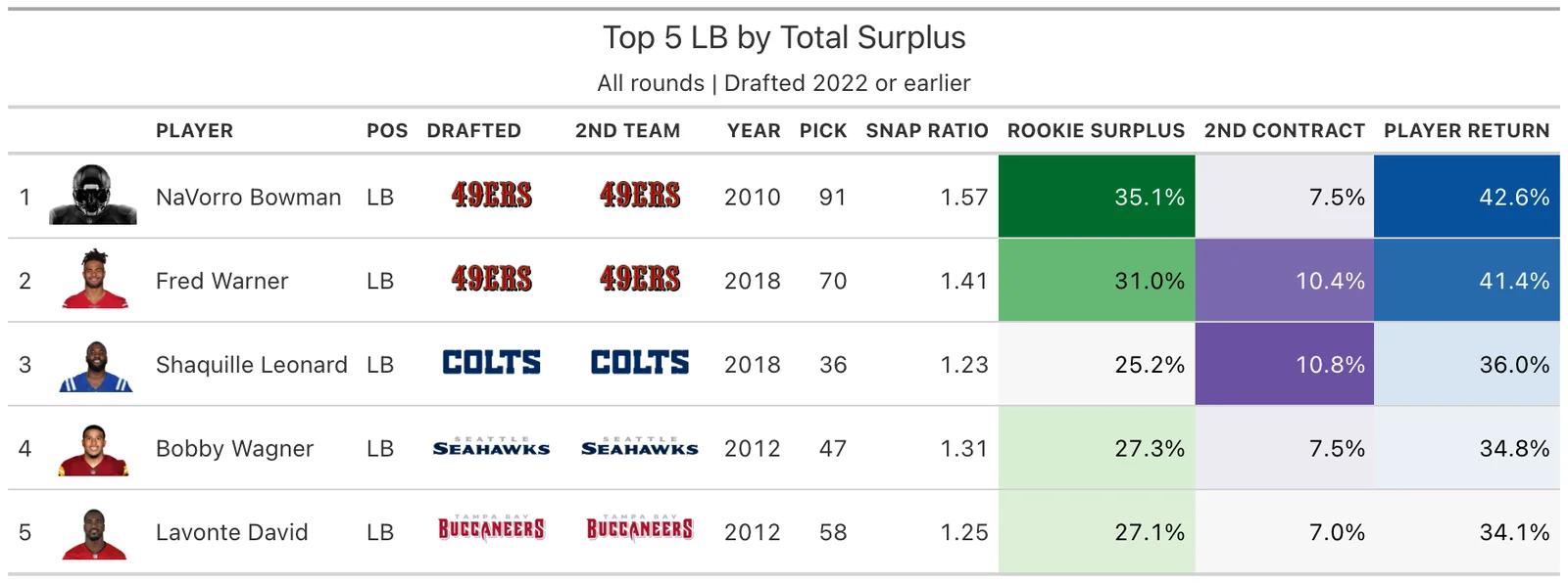
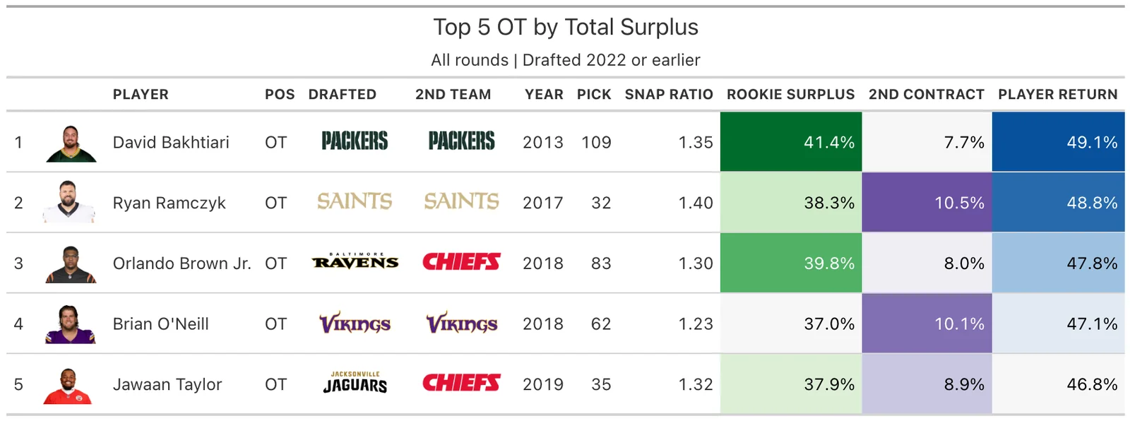
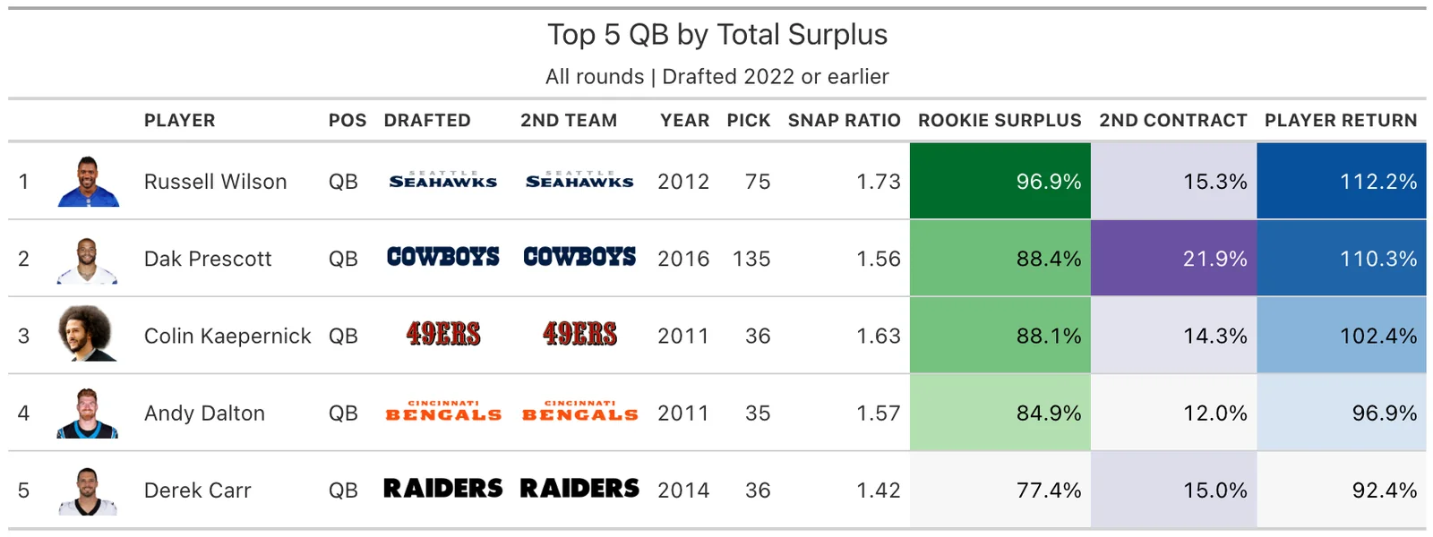
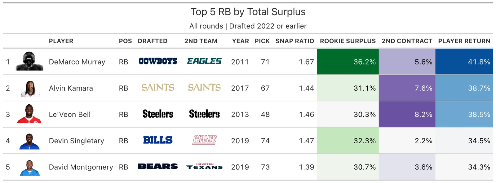
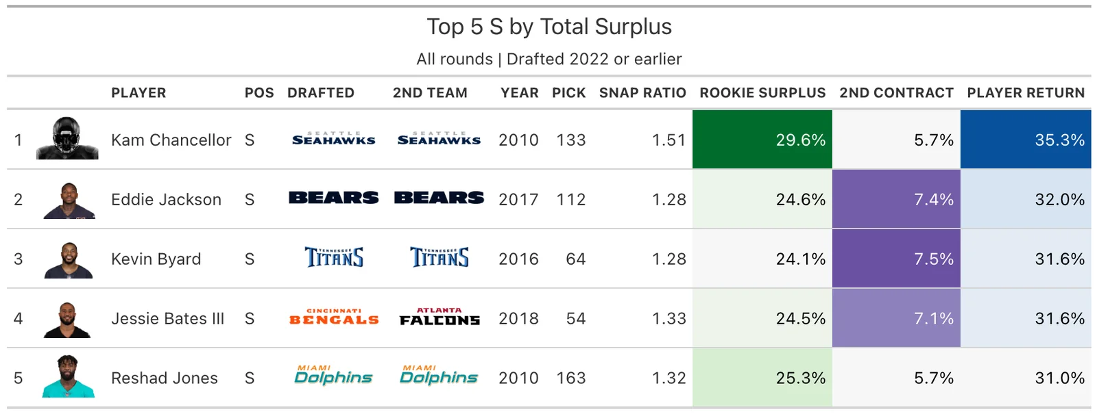
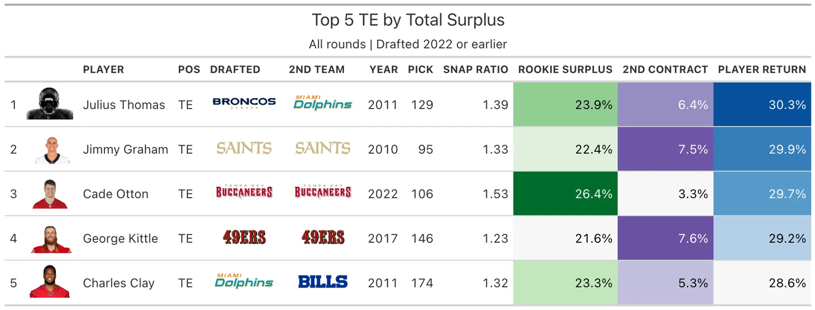
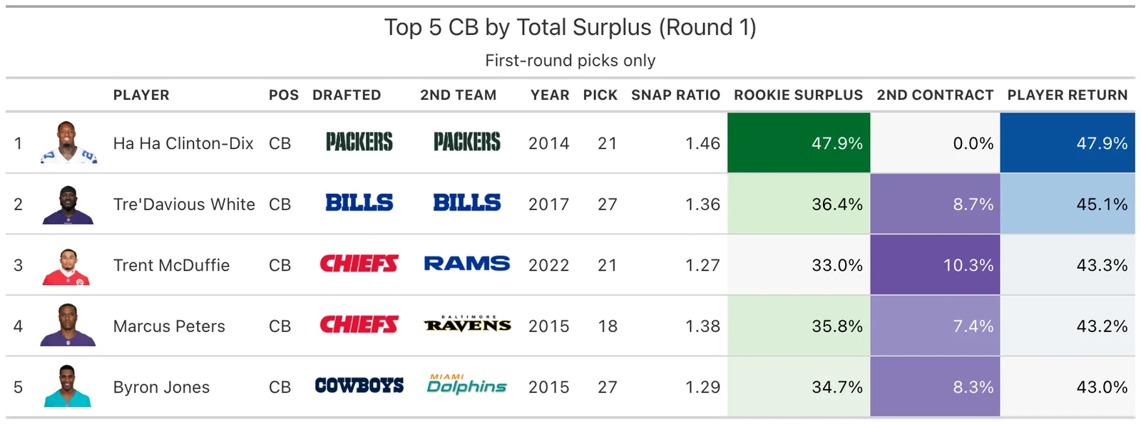
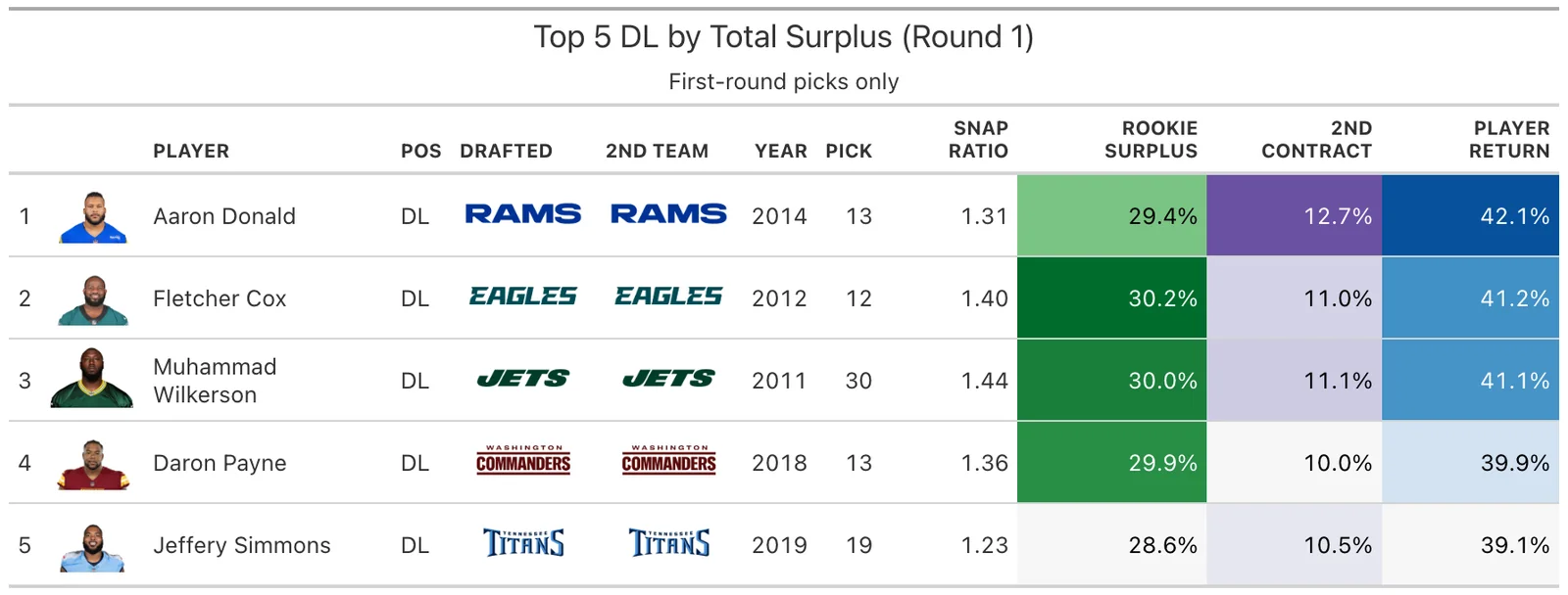
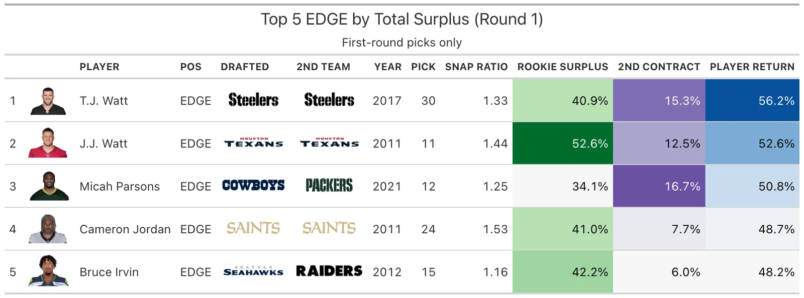
Appendix: Top 5 by Position Group (Round 1 Only)
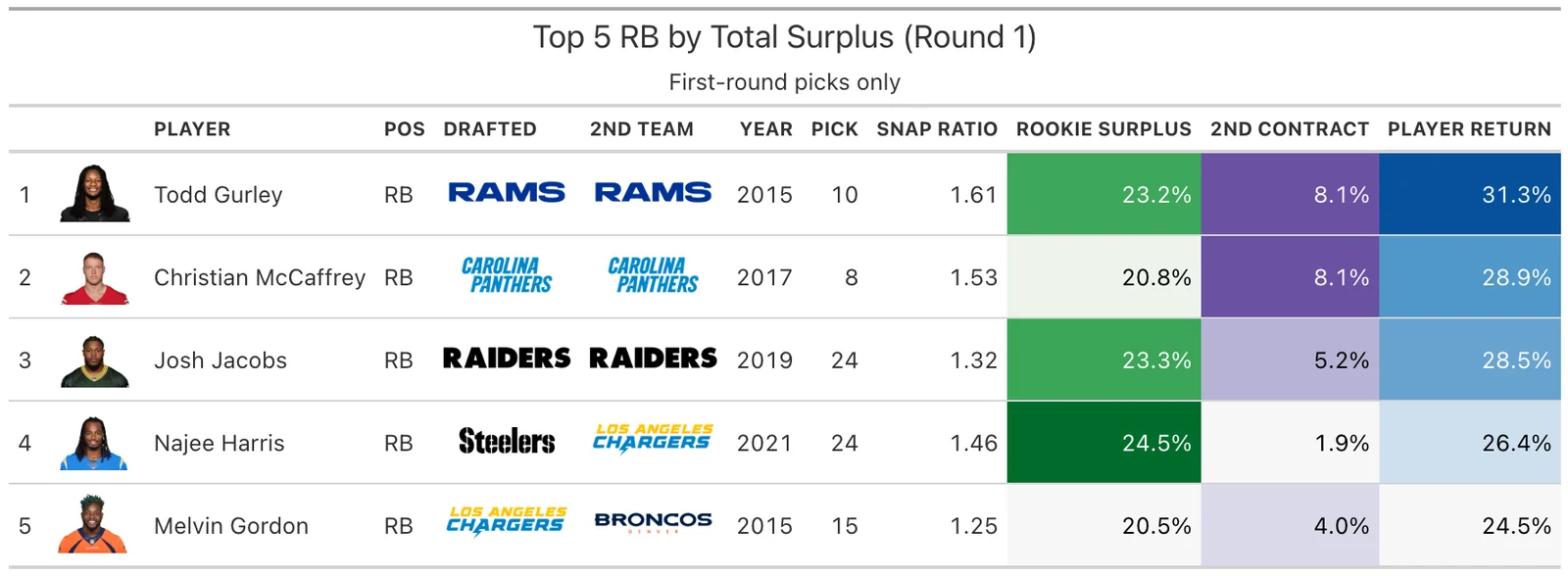
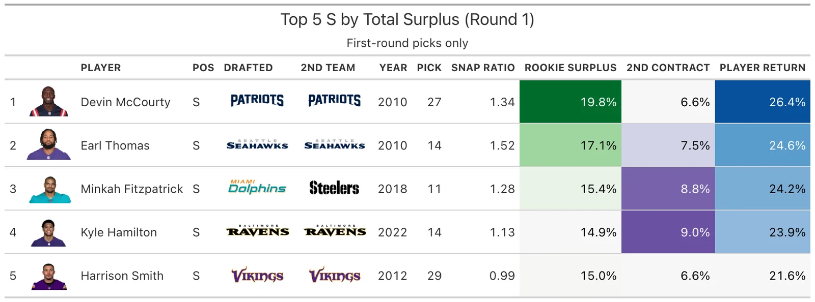
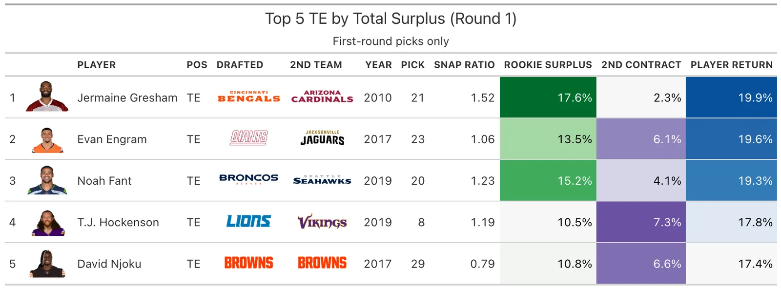
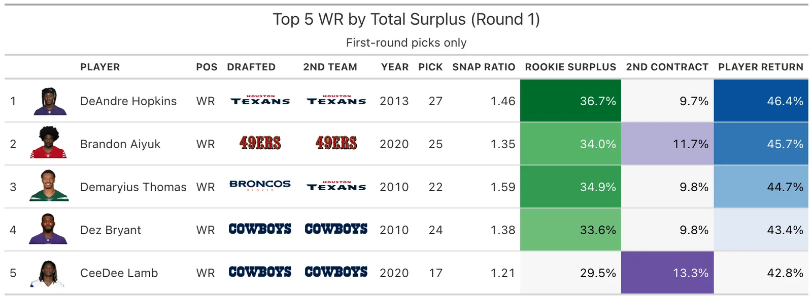
Appendix: Full Sharpe Ratio Table
| Position | Tier | N | Hit Rate | P(Elite) | Mean Return | FA Replacement | Sharpe Ratio |
|---|---|---|---|---|---|---|---|
| CB | Top 10 | 15 | 53.3% | 6.7% | 0.2176 | 8.20% | -0.608 |
| CB | Late 1st | 43 | 30.2% | 27.9% | 0.2448 | 8.20% | 0.080 |
| CB | Round 2 | 56 | 19.6% | 23.2% | 0.2159 | 8.20% | -0.038 |
| CB | Round 3 | 64 | 7.8% | 12.5% | 0.1405 | 8.20% | -0.300 |
| CB | Rounds 4-7 | 321 | 3.7% | 4.7% | 0.0840 | 8.20% | -0.602 |
| DL | Top 10 | 7 | 85.7% | 14.3% | 0.2403 | 7.50% | -0.284 |
| DL | Late 1st | 34 | 44.1% | 29.4% | 0.2677 | 7.50% | 0.231 |
| DL | Round 2 | 35 | 14.3% | 14.3% | 0.1924 | 7.50% | -0.229 |
| DL | Round 3 | 52 | 9.6% | 13.5% | 0.1924 | 7.50% | -0.267 |
| DL | Rounds 4-7 | 159 | 1.9% | 2.5% | 0.0970 | 7.50% | -0.696 |
| EDGE | Top 10 | 22 | 50.0% | 36.4% | 0.2759 | 9.10% | 0.265 |
| EDGE | Late 1st | 45 | 35.6% | 48.9% | 0.3207 | 9.10% | 0.594 |
| EDGE | Round 2 | 48 | 16.7% | 27.1% | 0.2399 | 9.10% | -0.009 |
| EDGE | Round 3 | 55 | 9.1% | 14.5% | 0.1766 | 9.10% | -0.297 |
| EDGE | Rounds 4-7 | 207 | 2.9% | 5.3% | 0.0947 | 9.10% | -0.604 |
| IOL | Top 10 | 6 | 50.0% | 0.0% | 0.1608 | 5.10% | -0.689 |
| IOL | Late 1st | 28 | 57.1% | 0.0% | 0.1654 | 5.10% | -0.711 |
| IOL | Round 2 | 38 | 47.4% | 0.0% | 0.2096 | 5.10% | -0.757 |
| IOL | Round 3 | 55 | 27.3% | 1.8% | 0.1425 | 5.10% | -0.477 |
| IOL | Rounds 4-7 | 203 | 5.4% | 0.5% | 0.0574 | 5.10% | -0.661 |
| LB | Top 10 | 8 | 50.0% | 0.0% | 0.1640 | 6.10% | -0.781 |
| LB | Late 1st | 21 | 33.3% | 0.0% | 0.1834 | 6.10% | -0.804 |
| LB | Round 2 | 41 | 26.8% | 7.3% | 0.1823 | 6.10% | -0.352 |
| LB | Round 3 | 45 | 24.4% | 8.9% | 0.1471 | 6.10% | -0.260 |
| LB | Rounds 4-7 | 218 | 2.8% | 0.0% | 0.0580 | 6.10% | -0.805 |
| OT | Top 10 | 17 | 76.5% | 29.4% | 0.2600 | 8.15% | 0.184 |
| OT | Late 1st | 30 | 50.0% | 46.7% | 0.2815 | 8.15% | 0.562 |
| OT | Round 2 | 28 | 39.3% | 46.4% | 0.2630 | 8.15% | 0.468 |
| OT | Round 3 | 31 | 16.1% | 19.4% | 0.1913 | 8.15% | -0.130 |
| OT | Rounds 4-7 | 112 | 4.5% | 8.0% | 0.1065 | 8.15% | -0.445 |
| QB | Top 10 | 26 | 73.1% | 73.1% | 0.5751 | 14.60% | 0.374 |
| QB | Late 1st | 14 | 21.4% | 42.9% | 0.3640 | 14.60% | -0.015 |
| QB | Round 2 | 12 | 33.3% | 41.7% | 0.4365 | 14.60% | -0.020 |
| QB | Round 3 | 19 | 5.3% | 26.3% | 0.2143 | 14.60% | -0.204 |
| QB | Rounds 4-7 | 78 | 2.6% | 5.1% | 0.0743 | 14.60% | -0.731 |
| RB | Top 10 | 7 | 71.4% | 0.0% | 0.1757 | 6.00% | -0.615 |
| RB | Late 1st | 12 | 33.3% | 0.0% | 0.1608 | 6.00% | -0.659 |
| RB | Round 2 | 36 | 44.4% | 2.8% | 0.1732 | 6.00% | -0.474 |
| RB | Round 3 | 33 | 30.3% | 18.2% | 0.1759 | 6.00% | 0.002 |
| RB | Rounds 4-7 | 206 | 3.4% | 0.5% | 0.0662 | 6.00% | -0.765 |
| S | Top 10 | 3 | 66.7% | 0.0% | 0.1159 | 5.30% | -0.805 |
| S | Late 1st | 17 | 52.9% | 0.0% | 0.1844 | 5.30% | -1.110 |
| S | Round 2 | 35 | 51.4% | 0.0% | 0.2034 | 5.30% | -0.653 |
| S | Round 3 | 26 | 19.2% | 0.0% | 0.1610 | 5.30% | -0.670 |
| S | Rounds 4-7 | 97 | 8.2% | 1.0% | 0.0985 | 5.30% | -0.551 |
| TE | Top 10 | 3 | 100.0% | 0.0% | 0.1260 | 4.80% | -0.822 |
| TE | Late 1st | 7 | 42.9% | 0.0% | 0.1602 | 4.80% | -1.220 |
| TE | Round 2 | 23 | 39.1% | 0.0% | 0.1658 | 4.80% | -0.656 |
| TE | Round 3 | 28 | 14.3% | 0.0% | 0.1263 | 4.80% | -0.538 |
| TE | Rounds 4-7 | 126 | 9.5% | 0.0% | 0.0836 | 4.80% | -0.587 |
| WR | Top 10 | 16 | 62.5% | 25.0% | 0.2449 | 7.90% | 0.035 |
| WR | Late 1st | 35 | 34.3% | 28.6% | 0.2465 | 7.90% | 0.121 |
| WR | Round 2 | 63 | 28.6% | 33.3% | 0.2459 | 7.90% | 0.227 |
| WR | Round 3 | 59 | 18.6% | 22.0% | 0.1888 | 7.90% | -0.040 |
| WR | Rounds 4-7 | 239 | 4.2% | 4.6% | 0.0777 | 7.90% | -0.623 |
Appendix: Team Position Strategy Since 2009
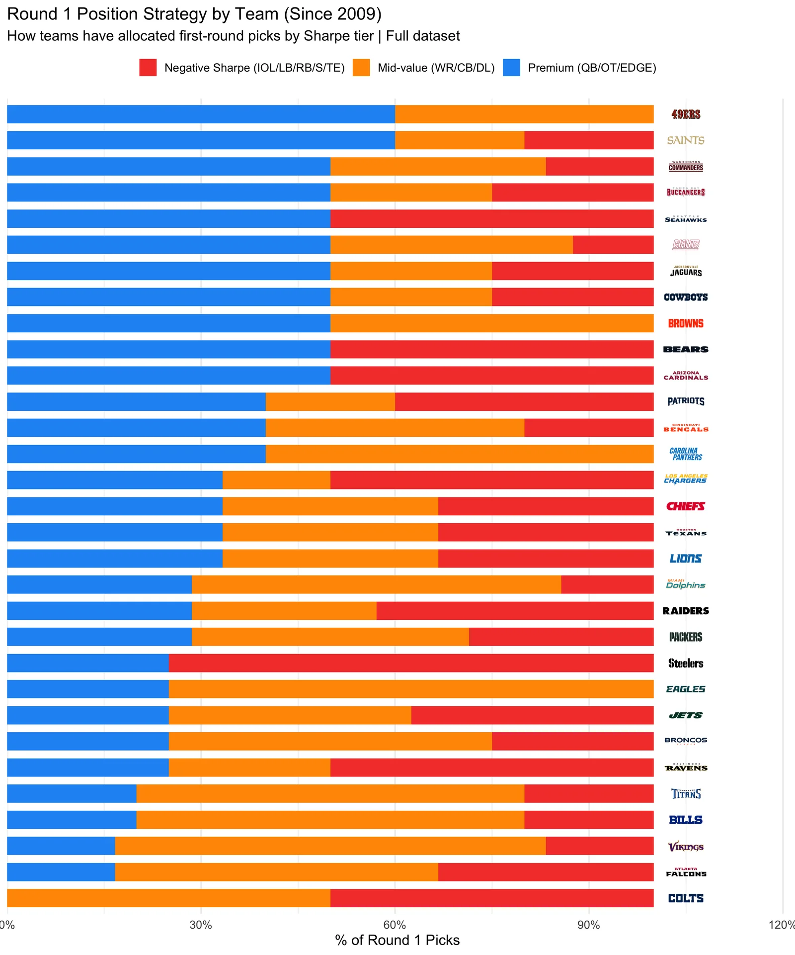
Data: nflreadr (PFR draft picks, snap counts, OverTheCap contracts). Methodology: Riske/PFF hit rates, Brill & Wyner 2024 nonlinear upside framework. Analysis covers drafted players 2009-2022 with snap count data available (2013+).